How To Create a Page Layout for a Losant Experience
An Experience View's layout holds elements and visuals that are common across all pages in your custom experience. This is generally one of the first things you'll create before building any other components or pages.
For this walkthrough, the layout that you'll be building looks like the following:
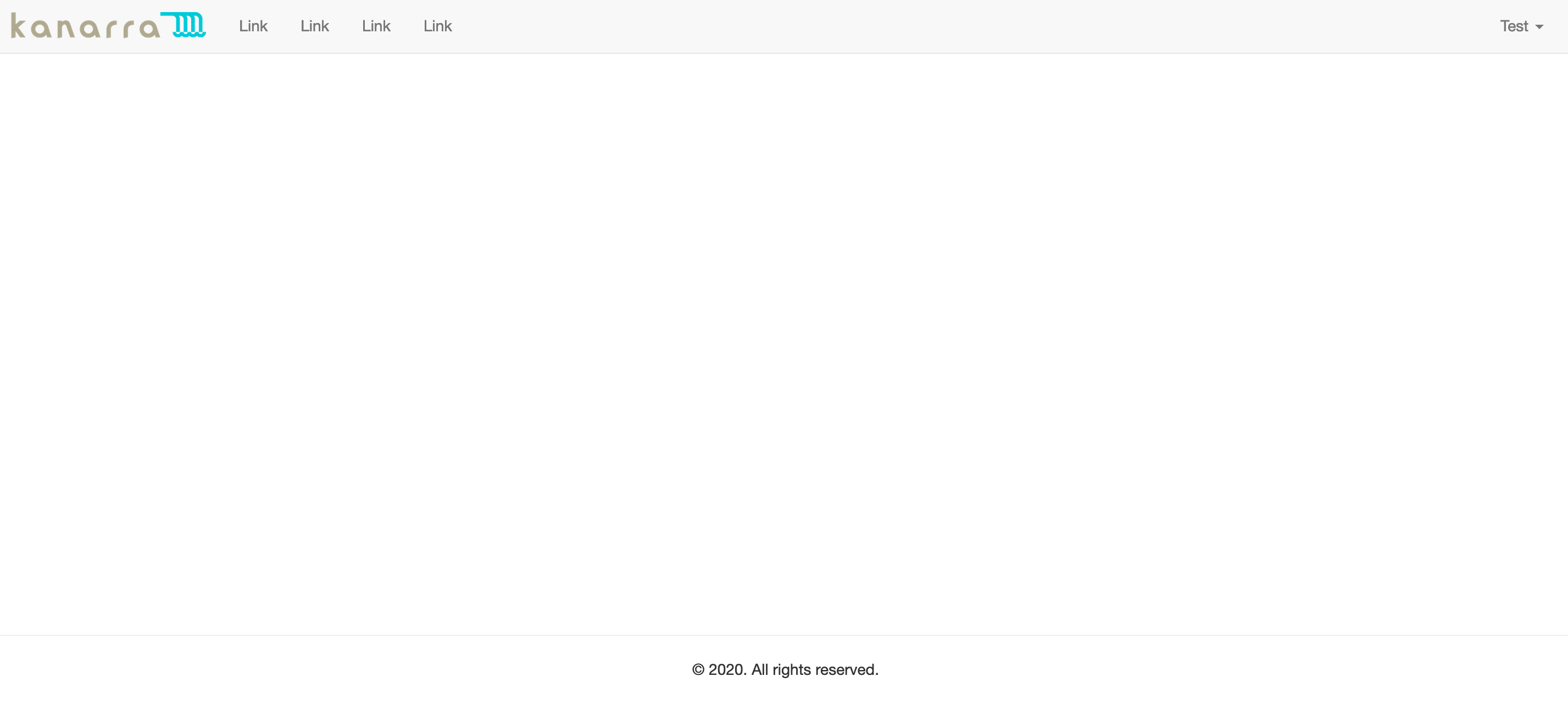
This layout includes a header and a footer. The header includes a logo, a few placeholder navigation links, and a "Log In" link. The footer includes a copyright statement. The blank space in the middle is where individual pages will be rendered within this layout.
Experience Views
The Experience Views functionality can be found in the "Edit" Experience section of Losant.
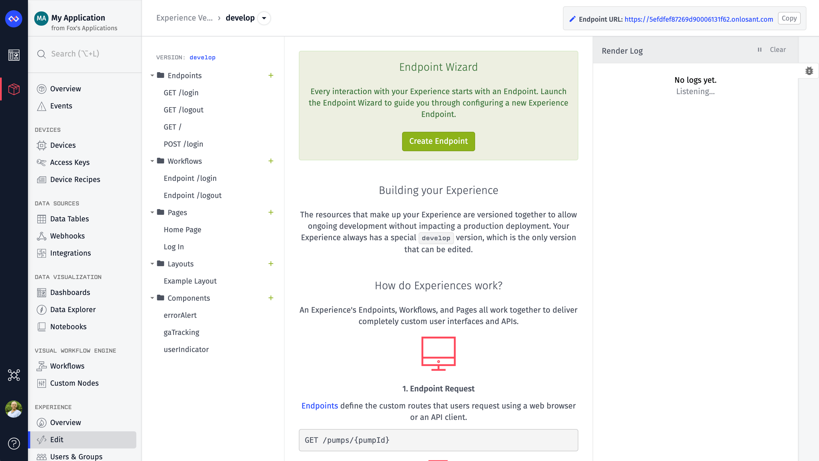
In the Edit section, you'll see multiple types of resources, including: Layouts, Pages, and Components. To create your Layout, click the Add button next to the Layouts folder.

Layouts
After you click the Add button, you'll be presented with a blank layout. Every layout requires a name and some content.
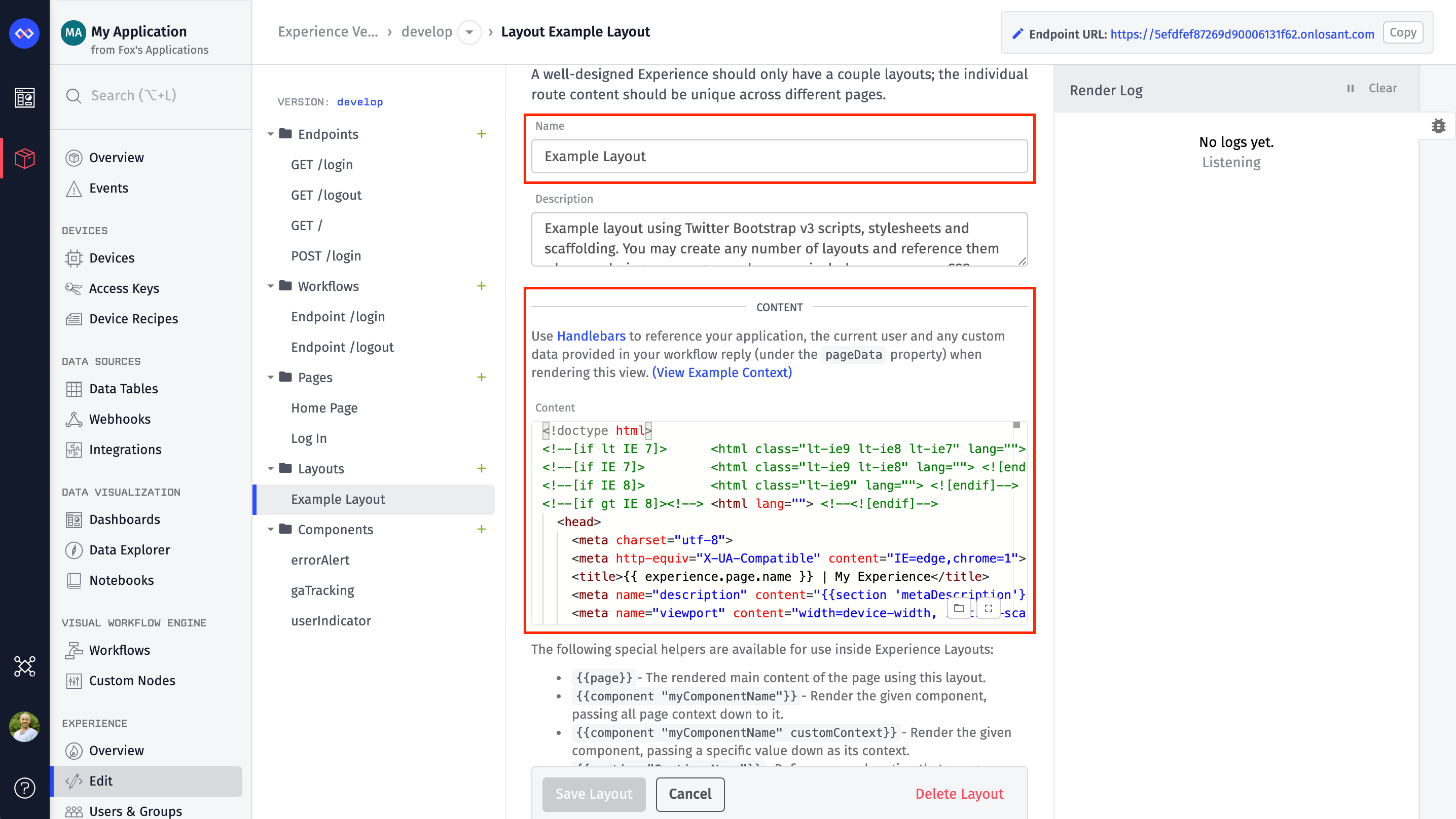
The HTML code for the example content can be found on GitHub. Feel free to copy/paste that into your newly created layout.
Layouts are defined as HTML and Handlebars templates. You can define a layout with any content you'd like. In this example, Twitter Bootstrap is used since it provides responsive scaffolding and common elements found on most web pages. Bootstrap, however, is not required.
Note: The remainder of this walkthrough is written assuming you are using Bootstrap as your framework.
HTML Title
Most of the HTML in the example layout is markup for laying out the content. The first is a template that can found in the header's title tag.
<title>{{ experience.page.name }} | My Experience</title>
Every time a page is rendered, some amount of context from your application is provided that you can use inside your page or layout. Some fields are guaranteed, like those found on the experience object. Custom data, which is provided by the workflow that's handling the current page request, is found on the pageData object. In this example, the page's title defaults to the name of whatever page is being rendered. For example, if the page that's being rendered inside this layout has a name of "Log In," the title of the page will be "Log In | My Experience." You'll want to change "My Experience" to something relevant to your use case.
HTML Meta Description
Immediately below the title is a tag for the description:
<meta name="description" content="{{section 'metaDescription'}}">
This uses a special section helper. A section defines a placeholder that can be filled by the page being rendered within this layout. In this case, you want the override the description meta tag on a per-page basis. You'll see this being used in later parts of this walkthrough.
Logo
The next thing to change is the logo at the top left of the page. Here is the logo in the example:
To download, right-click the image and select "Save Image As.."
<a class="navbar-brand" href="/" style="padding-top:0; padding-bottom:0;">
  <img alt="Logo"
       style="margin-top:13px; height: 24px;"
       src="IMAGE_URL">
</a>
This is a placeholder image provided as part of the example. To replace this image, you'll upload your logo somewhere, such as Files or Amazon S3, and replace IMAGE_URL in the src attribute with the new URL.
Alternatively, you can Base64 encode the image and place it directly in the layout.
Once your logo has been updated, click "Create Layout" at the bottom of the page. You have now successfully configured the example layout, and modified the content to better reflect your application. Next, you will move into components.
Components
The next item is the userIndicator component, which provides the "Log In" link in the top right corner of the page. This toggles between a "Log In" link and a dropdown menu displaying the user's first name based on whether a user is logged in.
{{component "userIndicator"}}
Components provide a way to group and reuse page elements. Components are added to a page or layout using the component Handlebars helper. The name of the component is then used to control which component should be placed on the page. In this example, the component's name is "userIndicator". To create that component:
Click the "Add" button at the top of the Components list.
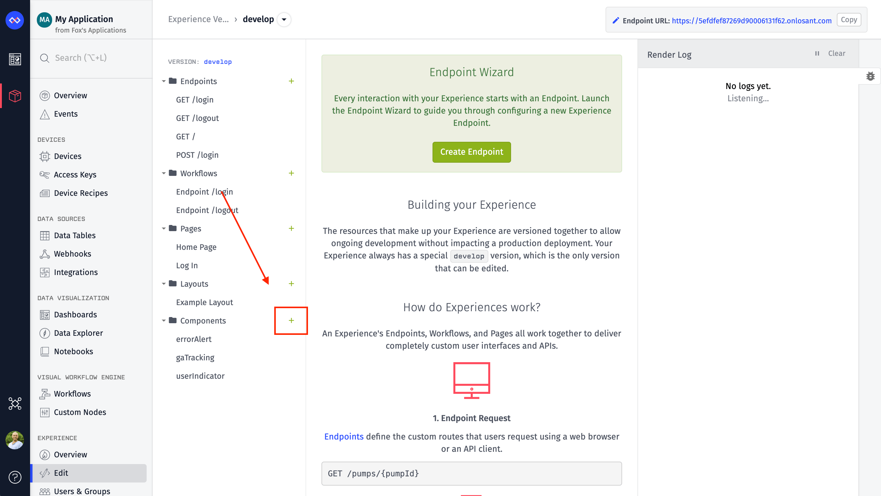
Just like with layouts, components require a name and some content.
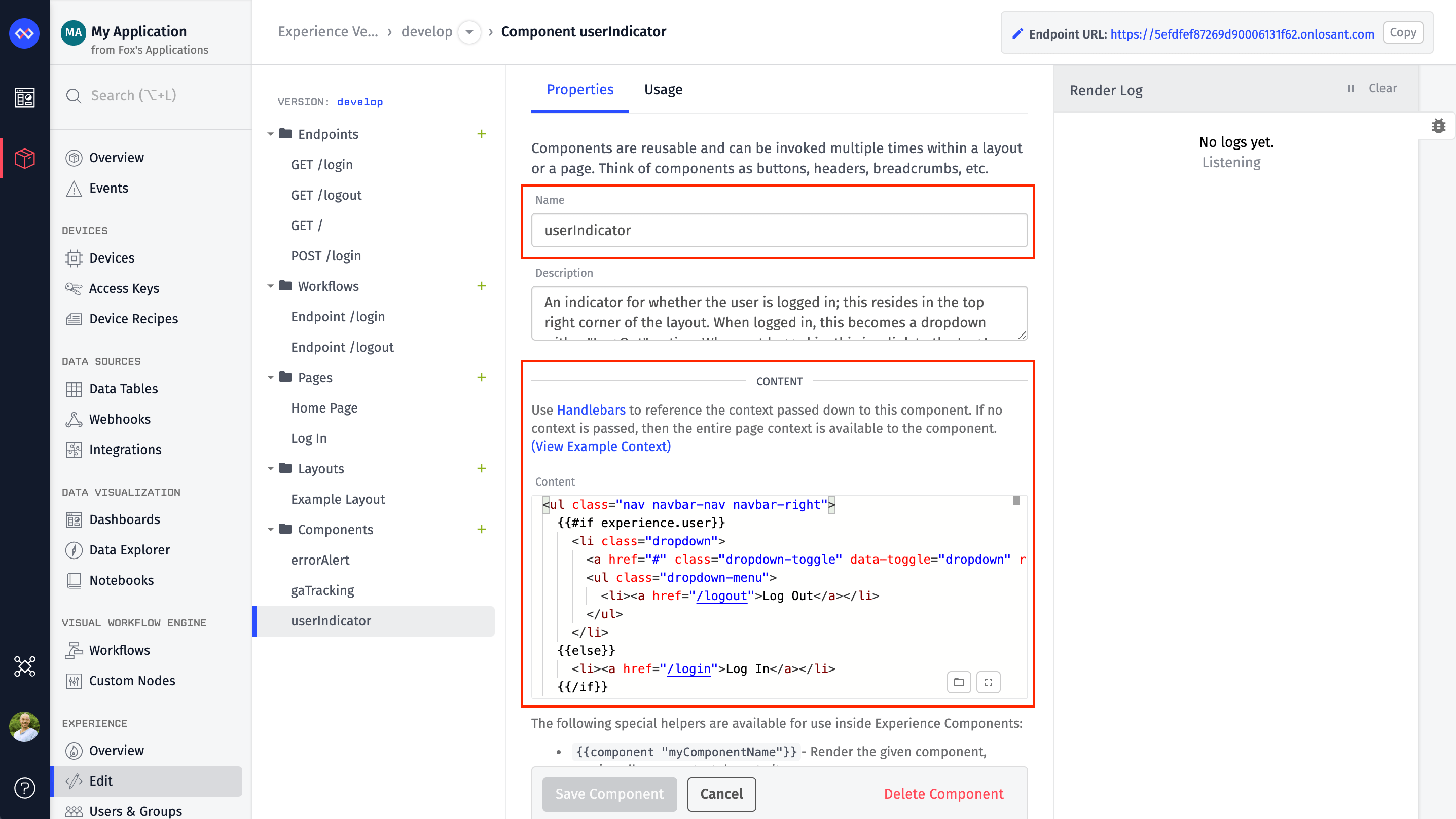
You can get the content for this example from GitHub. Since this component is fairly small, its content is also below. Copy/paste this into your new component. Click 'Create Component' at the bottom of the page.
<ul class="nav navbar-nav navbar-right">
  {{#if experience.user}}
    <li class="dropdown">
      <a href="#"
        class="dropdown-toggle"
        data-toggle="dropdown"
        role="button"
        aria-haspopup="true"
        aria-expanded="false">
         {{experience.user.firstName}}
        <span class="caret"></span></a>
      <ul class="dropdown-menu">
        <li><a href="/logout">Log Out</a></li>
      </ul>
    </li>
  {{else}}
    <li><a href="/login">Log In</a></li>
  {{/if}}
</ul>
If the user is logged in, a user object is automatically placed on the context for you. This component checks for that object to determine what to display. If there is no user object, it displays a "Log In" link. If the user object does exist, it displays the user's first name using the experience.user.firstName property and adds a menu item to log out.
Page Helper
Now return to the layout. You'll see the special page Handlebars helper after the user indicator component you just built.
{{ page }}
The page helper defines where the page should render in this layout. Every layout requires a page helper to be defined somewhere. You'll create pages in subsequent parts of this walkthrough.
Google Analytics
The last component on the page, gaTracking is used to add Google Analytics tracking to this custom web experience.
{{component "gaTracking" "UA-XXXXX-X"}}
As we did with adding the userIndicator, create a new component and name it gaTracking. The contents of this component can be found on GitHub and are also displayed below. To use this component, replace UA-XXXXX-X with your specific tracking ID that is provided by Google Analytics.
![]()
The contents of this component can be found on GitHub and are also displayed below.
<script>
  (function(b,o,i,l,e,r){b.GoogleAnalyticsObject=l;b[l]||(b[l]=
  function(){(b[l].q=b[l].q||[]).push(arguments)});b[l].l=+new Date;
  e=o.createElement(i);r=o.getElementsByTagName(i)[0];
  e.src='//www.google-analytics.com/analytics.js';
  r.parentNode.insertBefore(e,r)}(window,document,'script','ga'));
  ga('create','{{.}}','auto');ga('send','pageview');
</script>
This code is provided by Google Analytics, so it is outside the scope of this walkthrough. The important thing to notice is the following line and the {{.}} template.
ga('create','{{.}}','auto');ga('send','pageview');
When this component was used in the page layout, the tracking ID was provided as a second argument to the component helper. If you provide any data this way, the entire context for this component is replaced by whatever value you supply. This means you can now reference the tracking ID by using the {{.}} template. In Handlebars, a dot refers to the entire context object, which in this case is a string representing the tracking ID that was passed in.
What's Next
At this point, you now have a complete layout with two components. The next section of this walkthrough covers adding a "Log In" page that will be rendered within this layout.
Was this page helpful?
Still looking for help? You can also search the Losant Forums or submit your question there.