Experience Views
Experience Views allow you to build custom web interfaces on top of your connected device data and present those interfaces to your Experience Users. Views are rendered as a reply to an Experience Endpoint, and the data backing your views comes from a Losant Experience Workflow.
Through the combination of endpoints, workflows, views, and users, it is possible to build completely custom, web-based, user-specific solutions entirely within the Losant platform.
Viewing Experience Views

Views are versioned resources, so you must first choose one of your Experience Versions. (You may reach your application's "develop" version by clicking the "Edit" link in the sub-navigation.) After doing so, a list of your Experience Views is accessible in the left column tree view, categorized by type. This list is filterable and sortable using the tools at the top of the column. Clicking the view type folder will also display all views of the chosen type in a table view.
To view or edit the contents of an Experience View, click the name of the view in the left column tree view or within the view's table.
Adding an Experience View
There are three types of Experience Views; each serves a distinct purpose, and each is configured in a different way. To add a View, click the "+" icon alongside the type of view you would like to create in the left column. You can also click the "Add" button atop the table view.
Notes:
- Views can only be added, edited, or deleted within the "develop" version of your Experience.
- A view's type is not editable after creation; if you would like to change a view's type, you will have to create a new view of the type and copy the contents from the old view to the new one.

After doing so, you must enter the following information to create the view:
- Name: Enter a name for the view. The name must be unique across all other views of the same type in the application's "develop" version.
- When creating a Component, this name is how you will utilize the component in your other views. It is possible to change the name after creation, but you must also edit all references to the component to use the new name.
- Description: Optionally, enter a description of the view.
- For Layouts and Pages, the description is available in the default render context. Some developers choose to place their experience's meta description or other user-facing content in this field.
- Layout: When creating a Page, you may optionally choose one of your experience's Layouts to render the page within
- The chosen layout can be overridden per request in the Endpoint: Reply Node.
- View Tags: All view types support key-value pairs for storing additional information about the view. These values may be exposed to end users if desired.
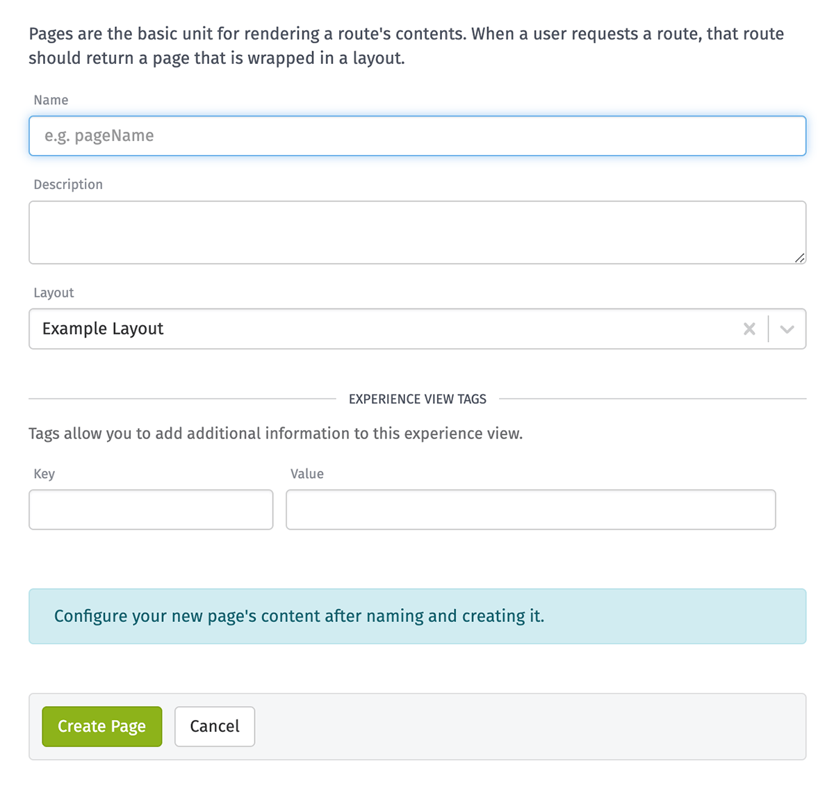
All of these values can edited post-creation in the view's "Properties" tab. Once you have created the view, you may enter its content on the next screen.
Editing an Experience View
After creating the view, you will be redirected to its "Content" tab, where you may enter the HTML and Handlebars templates that make up the view - or, in the case of Dashboard Pages, the properties of the dashboard to render.
There are special notes to consider when providing content for the different page types; refer to the documentation below for more info on Layouts, Pages, and Components.

Previewing Edits

To preview your view, you must first open the fullscreen version of the content editor, which can be done by clicking the button in the bottom right corner of the editor.
Note: This option is not available for Dashboard Pages.

Navigate to the Render tab to view a rendered preview of your current, unsaved view content. This will be rendered against an example context object; however, you may change the context by clicking on the "Edit" button in the top right corner. Layouts will show a placeholder page unless a valid pageId is specified in the context.

Selecting the HTML Preview tab allows you to preview the actual HTML that is rendered with the given view and context.

Inside the "Edit Context Object" modal you can use the Context Source dropdown to change the context against which to render your page. Depending on the selected option, additional input is required. Clicking Update will apply your changes.
Example Context Object

The Example Context Object option provides a boilerplate example context with some relevant properties such as your page and/or layout objects filled in.
Render Log Entry

The Render Log Entry option allows you to see exactly what was rendered for your user on a given view rendering.
Note: To use the Render Log Entry option, you must have render log entries available.
Select Endpoint & User

The Select Endpoint & User option allows you to build a context object by selecting the endpoint, page or layout, and user. Path Parameters are only available when selecting an endpoint that contains path parameters. Optionality is honored for path parameters. Query Parameters are always available and fully customizable. Page Data is treated as JSON and can provide custom data for your context object.
Note: To add HTTP request headers to your context object we recommend building your object with the above options, then clicking (Make Changes) to add headers from the Custom Context Object option.
Custom Context Object

Clicking (Make Changes) above any of the other options' Context Object preview will send you to the Custom Context Object option with the previous option's object auto-filled. From here you may fine tune the object as needed.
Component Usage

When previewing a component you can use the Component Usage field to describe a custom instance of your component. This will be rendered against the Context Object and within any layout you select.
Other View Properties

Navigate to the Properties tab to edit your view's name, description, and tags. For pages you may also set the layout in which to render the page.
Layouts
Layouts are "wrappers" in which pages are rendered. Most application experiences will only use one or maybe two layouts, as most customizations to a layout that would be applied on a per-page basis can be accomplished using {{section}} helpers.
The {{page}} Helper
Your layout must include a single {{page}} helper somewhere within it. Wherever the helper is included is where the Experience Page using the layout will be rendered.
Using Layouts
Layouts are chosen as an optional property of an Experience Page, though a page's layout can be overridden within the Endpoint: Reply Node on a per-endpoint-request basis.
Layouts are optional within your application experience. However, if you choose not to define a layout for any page, that page should include all the necessary markup to properly render a web page (your doctype declaration, etc.).
Example Layout
A layout includes common elements that are used in all web pages you are rendering within your experience; for example, a typical layout should include the following:
- Your
<!doctype html>declaration. - The HTML
<head>as well as any common<script>and<link>(stylesheet) tags. - Your opening and closing
<body>tags. - Common UI elements that do not change per page, such as your header and footer.
Here is an example of everything a layout should include:
<!doctype html>
  <html lang="">
  <head>
    <meta charset="utf-8">
    <title>{{#section "pageTitle"}}Welcome{{/section}} | My Experience</title>
    <meta name="description" content="">
    <meta name="viewport" content="width=device-width, initial-scale=1, shrink-to-fit=no">
    <!-- Stylesheets should be included in the head, and they must be served from a third-party CDN -->
    <link rel="stylesheet" href="https://maxcdn.bootstrapcdn.com/bootstrap/3.3.7/css/bootstrap.min.css">
    <!-- we can add per-page styles using a {{#fillSection}} helper within a page -->
    {{section "pageStyles"}}
  </head>
  <body>
    <div class="wrapper">
      {{ component "mainNav" }}
      <!-- the page's content renders here -->
      {{ page }}
      {{ component "footer" }}
    </div>
    <!-- some scripts that are used on all pages can be included here -->
    <script src="https://code.jquery.com/jquery-3.2.1.slim.min.js"></script>
    <script src="https://maxcdn.bootstrapcdn.com/bootstrap/3.3.7/js/bootstrap.min.js"></script>
    <!-- we can include scripts specific to the page using a section -->
    {{section "pageScripts"}}
  </body>
</html>
Pages
Pages are the fundamental Experience View type; without a page, it is impossible to render a custom user interface on top of your application data. You can have a single page for every endpoint in your application, or you can define pages that are used as templates for rendering specific types of data (e.g. a list of resources).
When defining your page content, you must first choose a Page Type. Select one of the following, with the value in parentheses (if applicable) being the Content-Type header value returned for this page ...
- HTML (text/html): When building an experience that returns web pages for your end users, this is usually the page type you will select.
- CSS (text/css): It is possible to return a Cascading Style Sheet in response to an endpoint request, though - unless you are rendering string templates with dynamic values from the payload - we recommend storing your style sheets in Application Files for improved page performance.
- JavaScript (application/javascript): Similar to CSS, custom JavaScript can be returned from an endpoint request, though Application Files are usually a better place for serving this content.
- JSON (application/json): When building an experience that serves a JSON API, this option can be useful for returning data rendered in a page instead of defining the content inline in an Endpoint Reply Node.
- Dashboard: This type is a special case that allows for returning a Losant Dashboard to the experience user, optionally configured with settings provided through the request payload. More information is available below.
- Custom Content-Type ...: Select this option to return a Content-Type that is not specified in another option. When selected, you must also specify the value of the Content-Type header. For example, when building an XML-based API, select this option and enter "text/xml" for the Content Type.
Pages are configured much the same way layouts and components are: by providing a mix of static content and syntax along with Handlebars expressions to reference the data passed down to the page. You may include any view components within your page content, in addition to providing {{#fillSection}} helpers for setting the contents of {{section}} helpers defined within a layout.
Dashboard Pages
The "Dashboard" page type makes it easy to render any dashboard that is also owned by the current application. This can be useful for adding some custom branding around your dashboard and also for controlling access to the dashboard (as well as default context settings) for your Experience Users.
A dashboard page takes several configuration settings, broken up into sections:
General Settings

- Dashboard: The dashboard to render. This can be a specific dashboard or a Handlebars helper referencing a dashboard ID in the render context provided to your page.
- Theme: Whether to render the dashboard in the "Light" or "Dark" theme.
Time Settings
All of the following settings can be set to specific values, or they can reference values passed through the page render context as Handlebars helpers.

- Time: The time (in Unix time) to render each block at. Providing no time will default the dashboard to the current time. (Read more about viewing past dashboard states.)
- When displaying the dashboard header, this value serves as the default value for the time selector - however, users may change the dashboard to display a different time.
- Duration: The global duration setting applied to the dashboard on render. This defaults to the dashboard's default duration setting. Select a specific value or choose the "Custom ..." option to input a duration in milliseconds, or a Handlebars helper.
- Dashboard blocks must be configured to utilize the global dashboard duration for this value to have any effect.
- Resolution: The global resolution setting applied to the dashboard on render. This defaults to the dashboard's default duration setting. Select a specific value or choose the "Custom ..." option to input a duration in milliseconds, or a Handlebars helper.
- Dashboard blocks must be configured to utilize the global dashboard resolution for this value to have any effect.
- Dashboard Header Display Options: Choose whether to display the dashboard's header when rendered in your page by choosing one of the following options ...
- Hide dashboard header and disallow viewing past states: When selected, the dashboard's name, description (if set), and duration/resolution and past state selectors are hidden from view, and end users are unable to use these controls to quickly navigate to other dashboard states. (Users may still view the dashboard in different time states if you expose the option to pass them through the request - i.e. as query parameters - and configure the settings above to utilize those values.)
- Display dashboard header and allow users to view past dashboard states: (default) When selected, the dashboard's time selector (for viewing past dashboard states) is exposed at the top of the page along with its name and description (if set). When this option is selected, there is one additional property users may opt in to displaying ...
- Allow users to update dashboard duration and resolution: When selected, the dashboard's global duration and resolution selector is exposed at the top of the dashboard, allowing end users to change these values and update the state of any dashboard blocks utilizing the variables.
Context Variables
You have the option to define the context variables for a dashboard page. Context variable values - but not variable names - support templates from the request context.

If you select a specific dashboard, the context variables name will auto-complete and show their default information. When context variables are not provided, the defaults defined on the dashboard will be used.
Note: When defining the value for a tag context variable, if you have picked a specific dashboard there will be both a tag key field and a tag value field (and both can be defined with templates). If you have not picked a specific dashboard, any tag context variable must be defined with a single JSON value that follows this format:
{ "key": "myKey", "value": "{{pageData.tagValue}}" }
Using Pages
In order to use a page, you must do the following:
- Define an Experience Endpoint for your users to visit.
- Build an Experience Workflow to handle the endpoint request and issue a response. (You can do this automatically from the endpoint's edit page.)
- Choose "Experience Page" as the "Reply Type" in the Endpoint Reply Node and select your page as the one to render for the user.
In the Endpoint Reply node, you may optionally construct a pageData object to supply to the page. Note that there are a number of context properties available automatically, in addition to the pageData you may provide through the workflow.
Example Page
Given the example layout defined above, a typical page body may look like this:
{{#fillSection "pageTitle"}}
  This Is My Page Title
{{/fillSection}}

<!-- this content will populate the {{page}} helper within the layout -->
<div class="content">
  <h1>Hello there, {{experience.user.firstName}}!</h1>
  <p>You have access to the following devices:</p>
  <ul>
    {{#each pageData.devices}}
      {{component "deviceLink"}}
    {{/each}}
  </ul>
</div>
<!-- end page content. fillSections are removed from the document flow; their order and placement within the page does not matter. -->

{{#fillSection "pageStyles"}}
  <style type="text/css">
    .wrapper { width: 100%; } /* this page should be full-width */
  </style>
{{/fillSection}}
Components
Components are snippets of HTML and Handlebars that can be used within your layouts, pages or other components. Often components are invoked multiple times per page – such as when iterating over a list of items – but they can also be used simply as a means of cleaning up your code (for example, creating a component housing your experience's navigation code and referencing it one time in your layout).
Using Components
Components can be included within layouts, pages and other components. To render a component with the name "myComponentName", place the following helper where you would like the component to render:
Passing Custom Context
By default, a component has access to the entire page context object when it is invoked as {{component "myComponentName"}}. However, it is possible to specify the context passed down to a component by adding a third argument:
When passing context to a component, the passed context becomes the primary data available to the component. Its root value can be referenced with a period ({{.}}). If you wish to use the full context supplied to the page in this scenario, you must reference it under the "@root" property.
Passing Custom Arguments
In some cases, controlling component behavior with specific arguments makes more sense than passing an entire custom context object. This can be done using the name=value syntax:
Arguments passed to a component are available in the component under the @args variable. For the above example, using @args.myArg1 results in the value set for value1, and @args.myArg2 results in the string staticVal.
In addition, you can combine both passing custom context and arguments at the same time. See below:
Example Components
In our example page, we referenced a "deviceLink" component that was inside an {{#each}} loop. In such a use case, the current iteration of the loop is the default context passed to the page; however, as mentioned above, one may still reference the top-level context using a @root property.
With that in mind, the "deviceLink" component may look like the following (with an "active" class included on the link to the current URL):
<li class="{{#eq @root.request.params.deviceId id}}active{{/eq}}"><a href="/devices/{{id}}">{{name}}</a></li>
A component can also be a one-time use snippet that is called directly from a layout. In these cases, their use is more for code cleanup and readability than anything else. Given our example layout, our "footer" component may look like the following:
<hr />
<div class="footer">
© 2024. All rights reserved.
</div>
Linked Resources
All views have a "Usage" tab, which allows developers to see the places where the selected view is referenced or utilized. This can be helpful in determining if a view can be safely deleted or edited without breaking existing functionality.
Depending on the view type, the "Usage" tab will display one or more lists of linked resources ...
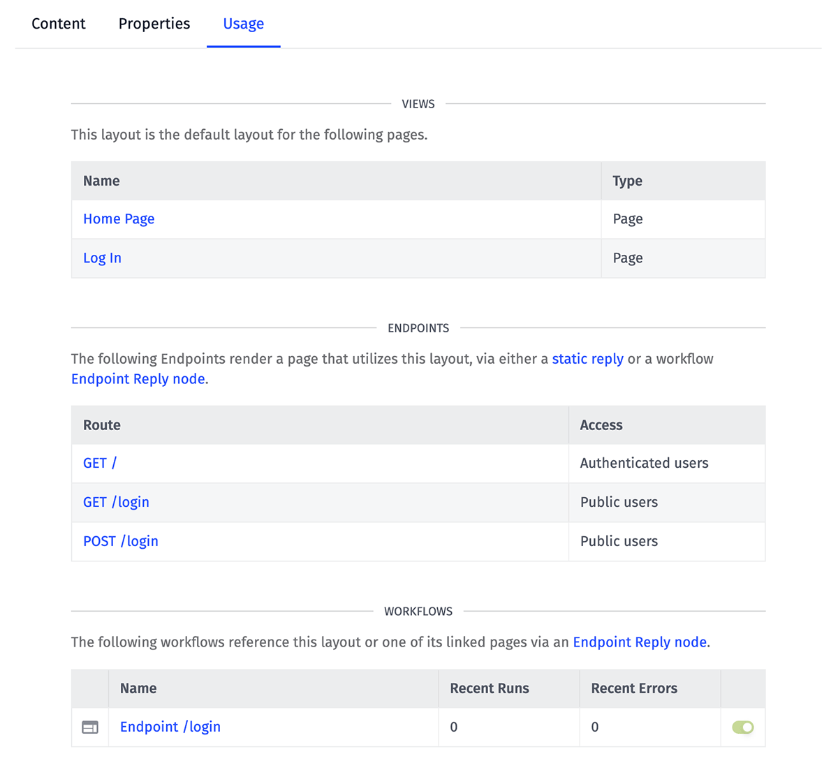
- Layouts display three lists ...
- All Pages that reference the layout as its default layout.
- All Endpoints that render a page that utilizes the layout, either through a static reply or an Endpoint: Reply Node.
- All Workflows that reference the layout or one its linked pages via an Endpoint: Reply Node.
- Pages display two lists ...
- All Endpoints that render the page, either through a static reply or an Endpoint: Reply Node.
- All Workflows that reference the page in an Endpoint: Reply Node.
- Components display a single list ...
- All Views that utilize the component in their content, as well as the view type.
Note: If your application uses string templates to dynamically render different pages or layouts based on the workflow payload, those resources will not appear in the lists described above.
Helpers
In addition to the string templates exposed through the rest of the Losant interface, there are a few special helpers available when rendering Experience Views ...
{{section}} Helpers
Your layout may optionally include multiple {{section}} helpers, which are blocks within the layout whose contents may be filled in by the page referencing the layout, or by components used within the page.
A section is defined as such, where "mySectionName" is a unique name within the layout:
To include default section content to render in the event that neither the child page nor any component fills the section, define the section like so:
The section's content is then defined in subsequent pages and their components using a {{#fillSection}} helper.
{{#fillSection}} Helpers
The contents of any {{section}} helper defined within a layout can be filled by including a {{#fillSection}} block helper within a page (or a component referenced within a page). The helper can be placed anywhere within that view, and its contents are removed from the rendering flow of the view and pushed to the layout. You can see examples of {{#fillSection}} helpers being used in the example page and example layout provided above.
Given a {{section "mySectionName"}} helper defined within a layout, its contents would be populated by including the following in your page or component:
When working with {{#fillSection}} helpers, keep the following rules in mind:
{{#fillSection}}helpers may be placed within pages, or within components that are called within those pages. If a component is referenced directly from a layout, its{{#fillSection}}declarations (and any{{#fillSection}}declarations from components referenced by that component) will be ignored.- When multiple
{{#fillSection}}helpers attempt to set the content of the same{{section}}(as in, when both a page and a component reference the same section name in a{{#fillSection}}declaration), the last declaration the renderer sees is the one that will populate the{{section}}. For this reason, it is a good idea to put a{{#fillSection}}helper at the bottom of your page's content to ensure it is not overridden by any child component (unless, of course, that is the desired behavior).
{{element}} Helpers
The {{element}} helper is a special helper that allows you to embed Losant elements within an Experience Page. Here are the following supported elements:
Dashboards
Using the {{element}} helper, you may embed a Dashboard directly into an Experience Page. Here is an example of its simplest usage:
The {{element 'dashboard'}} helper takes the following arguments:
dashboardId: The ID of the dashboard to render. Required.theme: The theme to use for the dashboard. Default islight; acceptable values arelightanddark.time: The time (in Unix time) to render each block at (also known as a past dashboard state). Providing no time will default the dashboard to the current time; providing a time will prevent live stream blocks from presenting data.duration: The global duration setting applied to the dashboard, in milliseconds. If not provided, this defaults to the dashboard’s default duration setting. This setting only affects dashboard blocks that use the global duration in their configurations.resolution: The global resolution setting applied to the dashboard, in milliseconds. If not provided, this defaults to the dashboard’s default resolution setting. This setting only affects dashboard blocks that use the global resolution in their configurations.hideHeader: If the header on the dashboard should be hidden. Default isfalse; acceptable values aretrueandfalse. If the header is hidden, this will prevent the end user from viewing past dashboard states and viewing the dashboard in fullscreen mode.showDurationControls: If the dashboard wide controls for duration and resolution should be shown. Default isfalse; acceptable values aretrueandfalse. IfhideHeaderis true, this argument has no effect and the controls are never shown (as these controls are placed in the header).ctx: An object of values for the context variables for the dashboard. This object may be constructed using the{{obj}}helper.
For added flexibility, you may reference properties on the current payload as values for these arguments:
You also have the option to build your dashboard context object:
In the snippet above, we are giving pageData.deviceID as the deviceId-0 context variable and pageData.deviceTagKey/pageData.deviceTagValue as the deviceTag-0 context variable. While it's recommended to use the obj helper to declare each context variable explicitly, you may directly pass in an object like so: ctx=pageData.context.
{{file}} Helpers
The {{file}} helper is a special helper that allows you to get the URL for a Losant File in an Experience Page, Layout, or Component. The following example would print out the public URL of the public file located at /images/logo.png in your application files:
If you would like to render an image, you can wrap this in an image tag like so:
<img src="{{file '/images/logo.png'}}"/>
Note: The {{file}} helper can only be used within Experience Views (Pages, Layouts, and Components). It is not available in other Losant templating contexts, such as dashboards or workflow nodes.
Private Files
The {{file}} helper can also render a signed URL for a private file by passing in additional options, like so:
The private=true flag indicates that this is a private file (since private and public files can have conflicting paths and file names). The ttl argument is optional; it indicates the time-to-live of the signed URL in seconds. If not provided, it defaults to 900 seconds (15 minutes).
Referencing Context
Data passed down to your views can be referenced using standard Handlebars paths. It is through this method that different user interfaces can be provided depending on the user requesting the page, the endpoint being viewed and the data returned by your backing workflow.
Data That is Always Provided
The following data is available in your root context from any layout, page or component:
{
  time, // the time of the request
  application, // object containing the application name and ID
  experience: {
    user, // object containing info on the user who made the request (if available)
    endpoint, // object containing info on the endpoint config
    page, // object containing info on the page config
    layout, // object containing info on the layout config,
    version // the version of the experience for the request
  },
  flow, // object containing the backing workflow's name, ID and version
  globals, // key/value mapping of any global variables from the application / workflow
  request: {
    path, // the actual request path
    method, // request method (e.g. get, post, patch, delete)
    headers, // object with header names as keys and their values mapped to them
    params, // object with path params as keys and their values mapped to them
    query, // object with query params as keys and their values mapped to them
    body, // request body (if applicable, e.g. in a post or patch request)
    cookies // object with cookie names as keys and their values mapped to them
  },
  pageData // object containing the custom data passed down from the workflow
}
The pageData Property
When replying to your endpoint request with an experience page, you have the option of passing additional information down to the view; that data is generated by the workflow replying to the request. All of that data is available under the pageData property within the view's context.
Render Logs
For debugging purposes, Losant provides a live log of render attempts for your experience views. This log creates an entry for every attempted page render (including failures), along with additional data about the render attempt, such as the chosen layout and any components referenced within.

The full log is available on the Experience Version overview page. If you'd like to watch the log for a single component, visit that component's edit page and the log's contents will be limited to just that component.
Deleting Experience Views
A view can be deleted by clicking the "Delete" icon next to any view on the list page, or by clicking the "Delete" button in the footer of a view's edit page.
Take Care When Deleting Views
If you delete a page, any endpoint replies referencing that page will fail to load. The same is true for layouts referenced by a page or overridden within an Endpoint Reply Node.
Deleted or renamed components will not cause the endpoint to fail; rather, the view will simply render no content in the spot where the offending component was referenced.
Was this page helpful?
Still looking for help? You can also search the Losant Forums or submit your question there.