How to Use the Template Library
The Template Library is organized into categories and the templates in each category are used in different ways, depending on what functionality is added to your application. Every template comes with a detailed README that contains specific setup and usage instructions.
Importing a Template
Each template contains a bundle with one or more pre-configured platform resources.
When a template is imported, those resources are automatically added to your application. A single template should only be imported once per application. If an import of the same template is attempted multiple times, the import is likely to fail due to conflicting resource names or other identifiers.
Template Resource Naming Convention
Some resources that are created by templates have names that are prefixed with tl (Template Library). This is used to avoid conflicts in cases where the name is required to be unique (e.g. Files and Components).
Some templates, like the Log In Form, do contain potentially conflicting resources without the tl prefix. This is seen in situations where the name is end-user facing, such as in Experience Endpoints. The tl prefix was removed because in nearly every case, you'd be required to rename the resource to use it in production. Refer to the template's README for details about potentially conflicting resources.
Editing Template Resources
Many templates contain resources that are intended to be edited after they're imported. The resources that a template creates are identical to those you'd create manually. Therefore, once a template is imported, you can freely edit those resources to modify its appearance or behavior as needed.
How to Use Experience Templates
Almost every template in the Experiences category is built using the Bootstrap v4 framework. This framework provides a CSS foundation on which to build any number of responsive web applications. To use experience templates, it is highly recommended that your entire experience is developed using this framework.
The Bootstrap 4 Layouts template contains all of the required markup to add Bootstrap to new experiences.
If you're starting from scratch, the code snippet below is an example Layout that demonstrates how to include Bootstrap into your own experiences. For more information, refer to Bootstrap's documentation.
<!DOCTYPE html>
<html lang="en">
  <head>
    <!-- Required meta tags -->
    <meta charset="utf-8" />
    <meta
      name="viewport"
      content="width=device-width, initial-scale=1, shrink-to-fit=no"
    />
    <!-- Bootstrap CSS -->
    <link
      rel="stylesheet"
      href="https://stackpath.bootstrapcdn.com/bootstrap/4.5.2/css/bootstrap.min.css"
      integrity="sha384-JcKb8q3iqJ61gNV9KGb8thSsNjpSL0n8PARn9HuZOnIxN0hoP+VmmDGMN5t9UJ0Z"
      crossorigin="anonymous"
    />
    <title>
      {{#section 'pageTitle'}}{{experience.page.name}}{{/section}} - My
      Experience
    </title>
  </head>
  <body>
    {{!-- The "container" class gives us the fixed width, centered layout.
    https://getbootstrap.com/docs/4.5/layout/overview/#containers --}}
    <div class="container">
      {{page}}
    </div>
    <script
      src="https://code.jquery.com/jquery-3.5.1.slim.min.js"
      integrity="sha384-DfXdz2htPH0lsSSs5nCTpuj/zy4C+OGpamoFVy38MVBnE+IbbVYUew+OrCXaRkfj"
      crossorigin="anonymous"
    ></script>
    <script
      src="https://cdn.jsdelivr.net/npm/popper.js@1.16.1/dist/umd/popper.min.js"
      integrity="sha384-9/reFTGAW83EW2RDu2S0VKaIzap3H66lZH81PoYlFhbGU+6BZp6G7niu735Sk7lN"
      crossorigin="anonymous"
    ></script>
    <script
      src="https://stackpath.bootstrapcdn.com/bootstrap/4.5.2/js/bootstrap.min.js"
      integrity="sha384-B4gt1jrGC7Jh4AgTPSdUtOBvfO8shuf57BaghqFfPlYxofvL8/KUEfYiJOMMV+rV"
      crossorigin="anonymous"
    ></script>
  </body>
</html>
How to Theme Experience Templates
All experience templates use Bootstrap's default theme and CSS classes. To change this theme according to your own branding guidelines, refer to the Bootstrap Theming documentation.
There is also a community marketplace for Bootstrap Themes where you can select pre-built themes that more closely match your desired style.
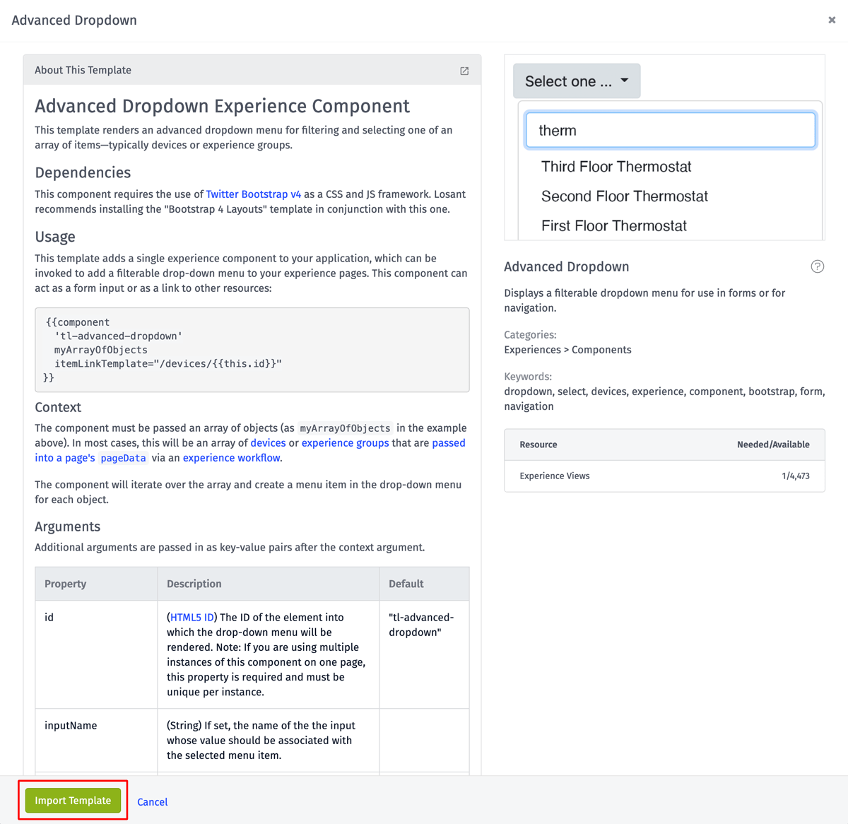
How to Use Experience Components
The Template Library contains several Experience Components, which provide a wide variety of pre-built functionality. Every component is named with a tl prefix and displays in your experience's "Components" folder after it's imported.
Components can support a wide variety of arguments to change its appearance or behavior. Refer to the component's README for instructions. All components are used with the following syntax:
Components in the Template Library are built using Bootstrap v4 and support any theme you apply. Components render their content into the page wherever they are used. The example below uses the Advanced Dropdown component to display a device filter inside the div element with the ID device-filter.
<body>
  <div id="device-filter">
    {{component 'tl-advanced-dropdown' pageData.devices
    itemLinkTemplate="/devices/{{this.id}}"}}
  </div>
</body>
Was this page helpful?
Still looking for help? You can also search the Losant Forums or submit your question there.