Data Table
The Data Table Block displays a list of rows from one of your application data tables.
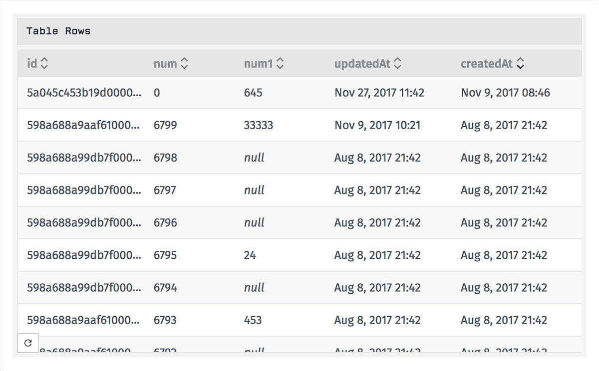
Configuration
Configuring the Data Table Block is broken up over three sections ...
Choosing a Data Table
First, choose one of your application's data tables from which rows should be returned.
Building a Query
Optionally, you may include a data table query to only return a subset of your table's rows.

The "Property" and "Value" fields for each section of the query support string templates resolving to values in your dashboard context. When building a query in Advanced Mode, the field supports JSON templates.
Setting Default Sort Order and Pagination
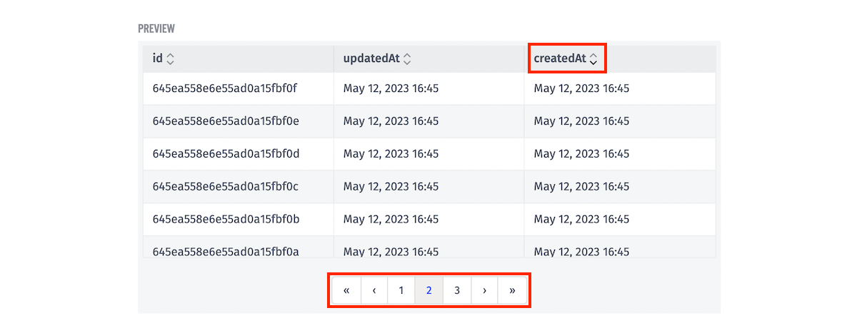
After choosing a table, you may use the sort arrows in the block preview's table header to set the default sort column and direction. Additionally, if there are more results than fit on a single page, you may use the pagination buttons in the block's preview to set the default pagination.
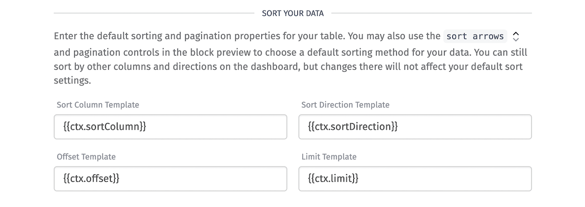
The following configuration fields are also available to set these values and make use of context variables:
- Sort Column Template is the column on the data table to sort by. By default, this field is
id. The following are valid sort fields:id,createdAt,updatedAt, as well as any custom columns on the table. This field is templatable. - Sort Direction Template is the direction the sort column sorts in. By default, this field is
asc. The valid sort directions areascanddesc. This field is templatable. - Offset Template is the number of results to skip, allowing you to paginate through large numbers of rows. This number must be positive, and the default is
0. This field is templatable. - Limit Template is the maximum number of rows to display per page. The max number of rows that can be displayed at once is 10000. The default is
1000. This field is templatable.
Dashboard users can choose different sort options by clicking the sort arrows and pagination buttons on the dashboard, but every time they leave the page and return to it, the block will reset to its default sort order and pagination.
Selecting and Ordering Columns
After selecting a data table you will be able to select which columns should be displayed and the order in which they should appear. By default, the block will display all available columns.
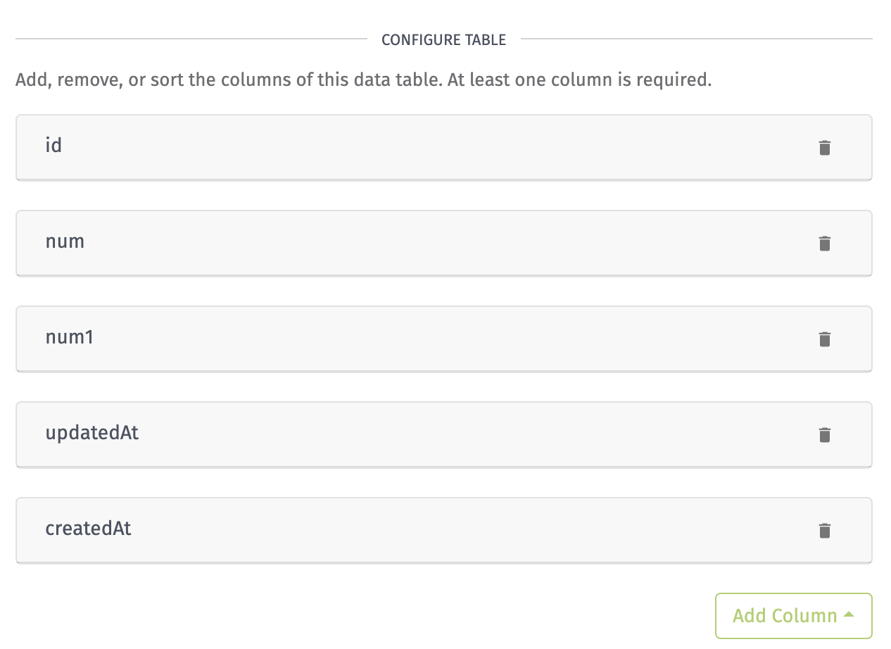
You can remove a column by clicking the remove icon on the right side of the panel, but note that all values per data table row will be included in the data response even if they are not being displayed.
If any columns have been removed or are missing from the current configuration, they can be added by clicking the Add Column button and selecting a column from the menu. Columns can be reordered by clicking and dragging the column panels. Columns that are at the top of the column configuration will appear in order from left to right inside the block.
Custom Columns
The Custom column provides access to all available data table information to be displayed in a completely custom way. It defaults to displaying the full row object, which holds all data table row properties.
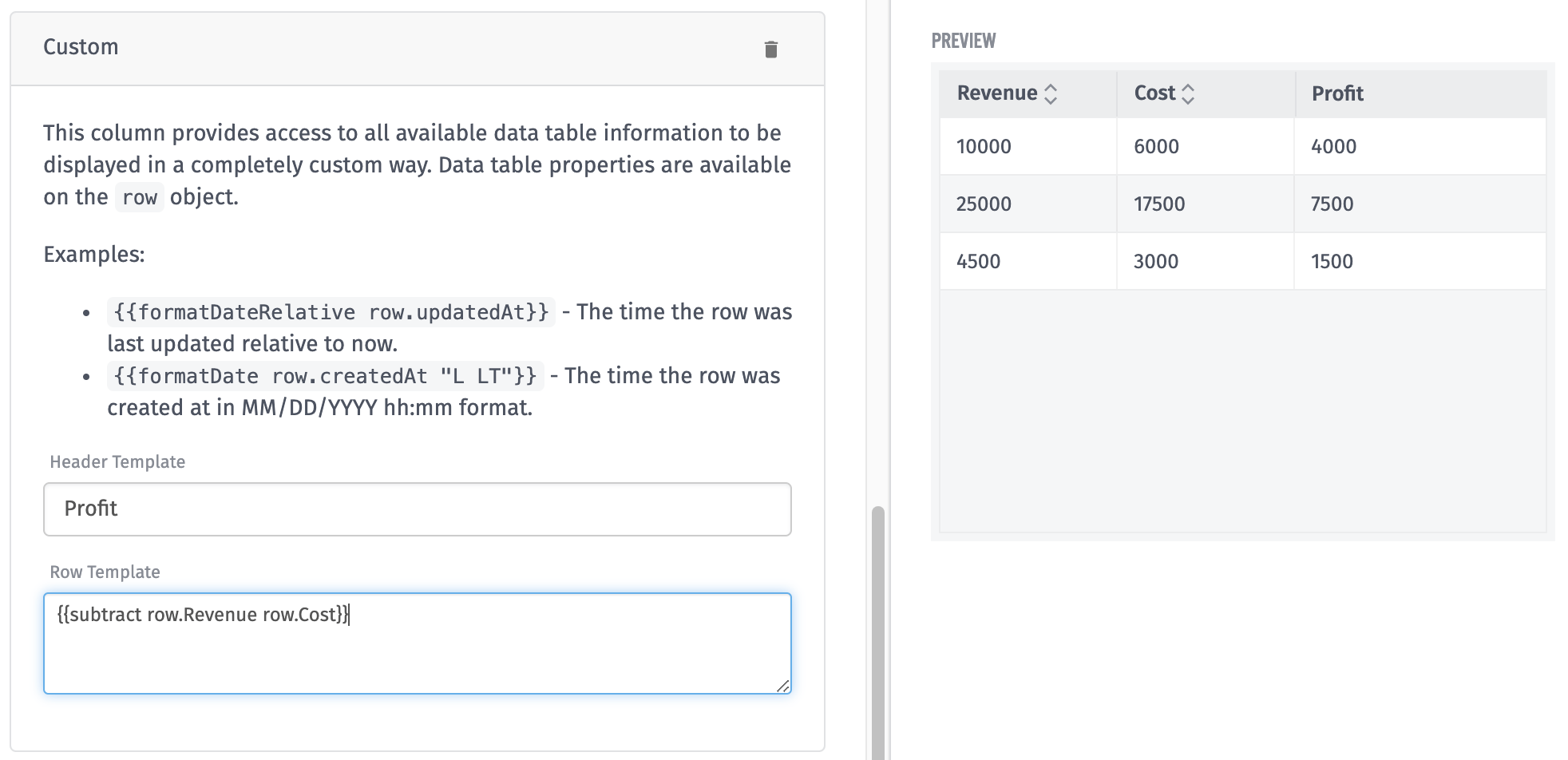
Above is an example of a custom column that uses the subtraction Handlebars helper to calculate profit from revenue and cost columns.
Was this page helpful?
Still looking for help? You can also search the Losant Forums or submit your question there.