Input Controls
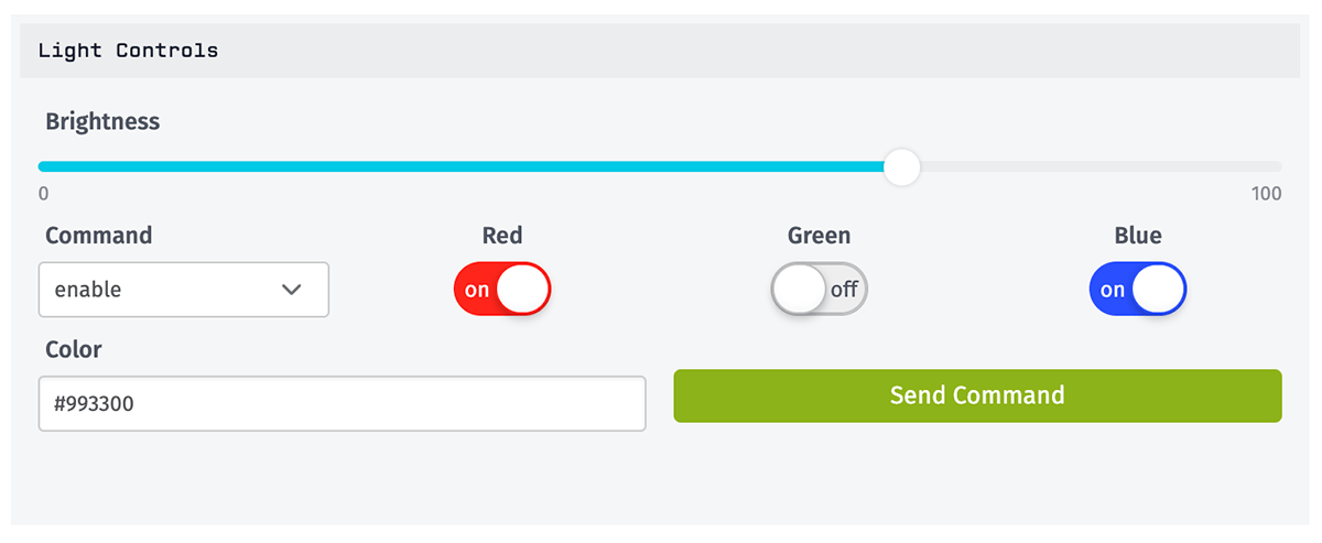
The Input Controls Block allows users to send device commands, or trigger workflows, directly from a dashboard. The block includes various input components to allow for configuring the payloads sent with those commands or triggers, and those components can also be configured to show the current state the application devices.
Adding and Removing Controls
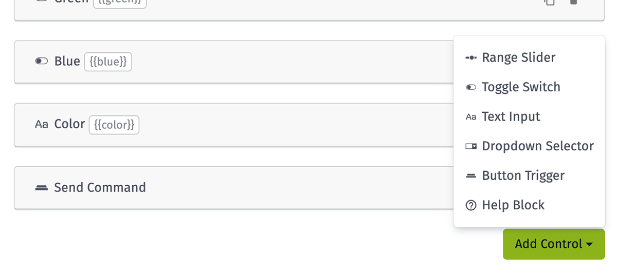
From the block's edit screen, controls can be added by clicking the "Add Controls" button at the bottom of the configuration panel. This will open a drop-down menu containing all of the available input types. On selection of a control type, a new configuration panel will appear for that input.
Controls can be removed from the edit screen by clicking the trashcan icon at the right side of the control's configuration panel.
Rearranging and Resizing Controls
On the edit screen, all controls can be resized and rearranged within the block. To move a control, simply click and drag the input to a new location. To resize an input, click and hold the handle in the bottom right corner of the control and drag the control to its new width.
Control Configuration
The block supports inputs of four types, plus a special "Help Block" component. The four inputs share a few common attributes:
- Label: All controls require a label attribute.
- Color: Controls other than text inputs can optionally be given a custom color.
- Template ID: Controls other than buttons are automatically assigned a Template ID, which can be used when constructing a device command or workflow payloads. This ID can be edited.
- Default Value: Controls other than buttons all get a default value, and optionally, each control can have its default value set by a device data query.
Dynamic Default Values
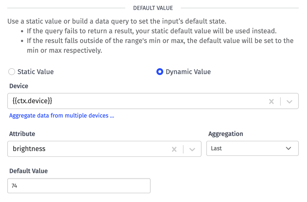
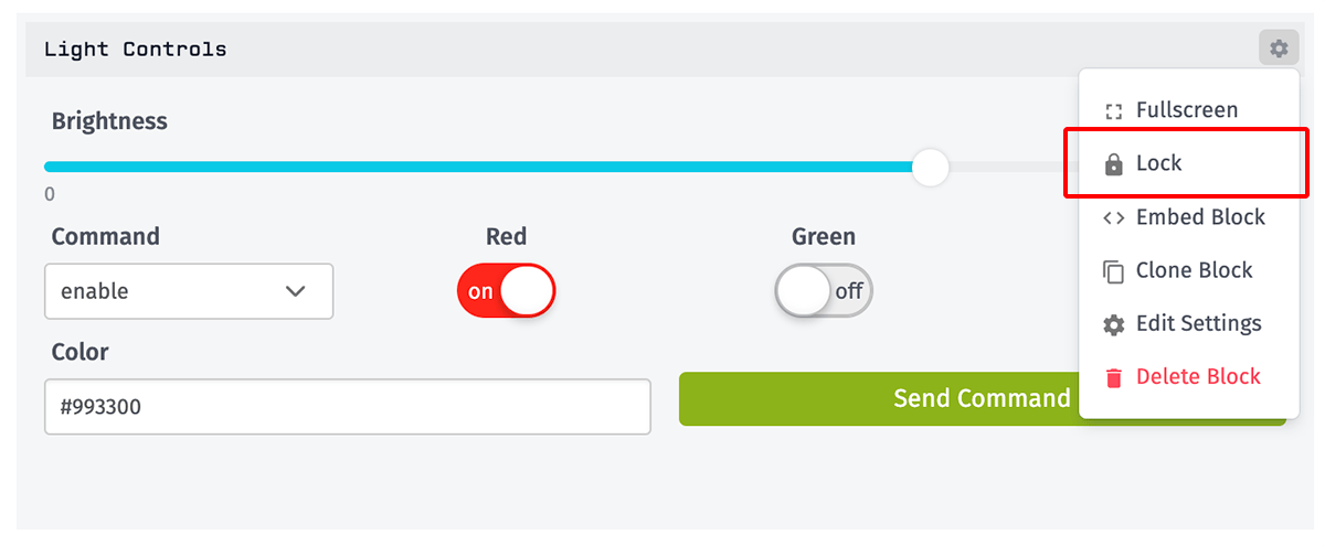
By setting dynamic default values for the selected controls, the functionality of the Input Controls Block can be extended to also serve as a series of simple gauges reflecting the last recorded state of the selected devices. When the block is "locked" (the lock/unlock option in the block settings menu), each of the controls that has a dynamic default set will update with a new value every time the dashboard refreshes.
Any control that has a dynamic default set is marked with an icon in the control's label. Any control whose query fails to return a result, or if the result cannot be cast to a value the input can display (such as a string being applied to a range input), will be indicated with a red icon. That input's default will fall back to the static value.
When setting a dynamic default value, the following values must be defined for the data query:
- Device: A device query targeting one or more devices from which to set the default value.
- Attribute: The attribute whose last reported value should be returned.
- Aggregation: The aggregation method by which the multiple results returned by the query (if applicable) should be reduced to a single value.
Range Sliders
Range sliders allow for the setting of number values. When configuring the input, it is necessary to define the range's minimum, maximum and default values, as well as the step size (the size of each "tick" in the range slider).
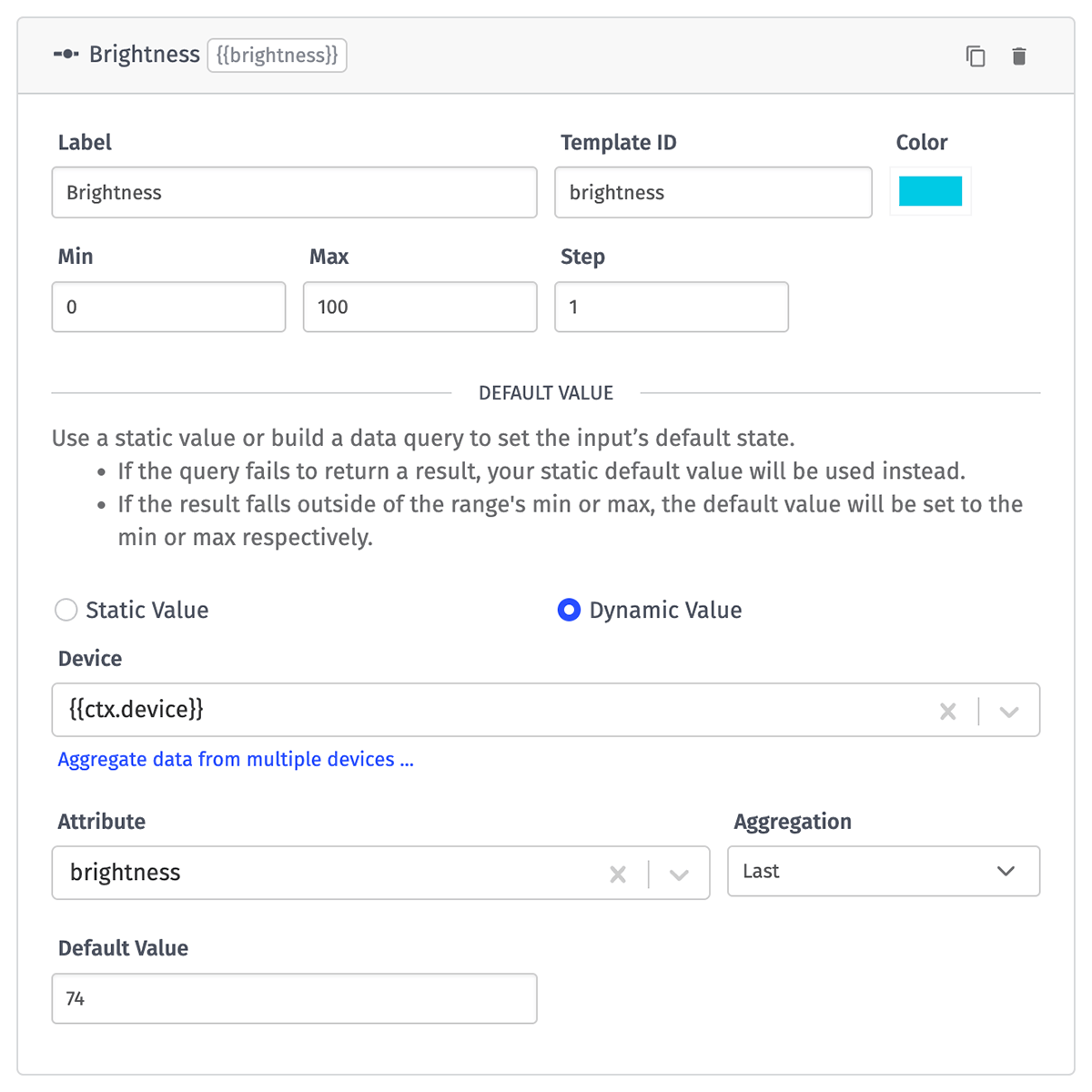
From the dashboard, the input's knob can be dragged left or right to set the numerical value to be sent in the payload. The area to the left of the knob will appear in the color selected during configuration.
Toggle Switches
Toggle switches allow for the setting of boolean values (true or false). The default value must be set. You may optionally also display "off" and "on" within the toggler for additional clarity.
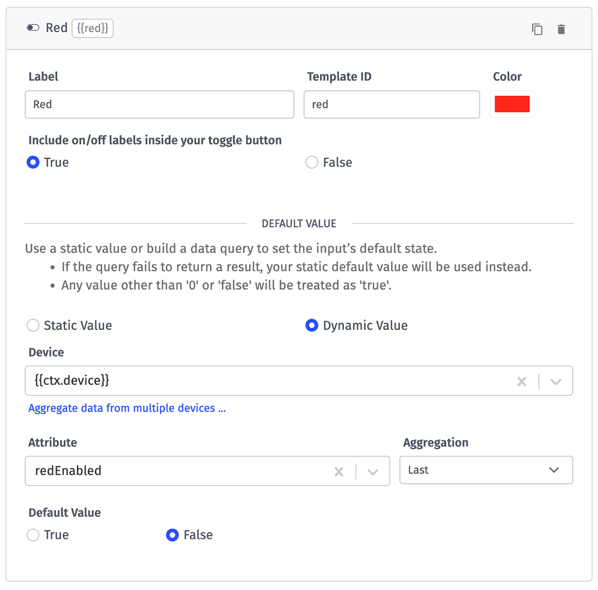
From the dashboard, the toggle can be flipped between the two values. When set to true, the toggle's background will match the color chosen for it during configuration.
Text Inputs
Text inputs allow for the setting of arbitrary values, usually as a string. The control may be left empty by default if desired.
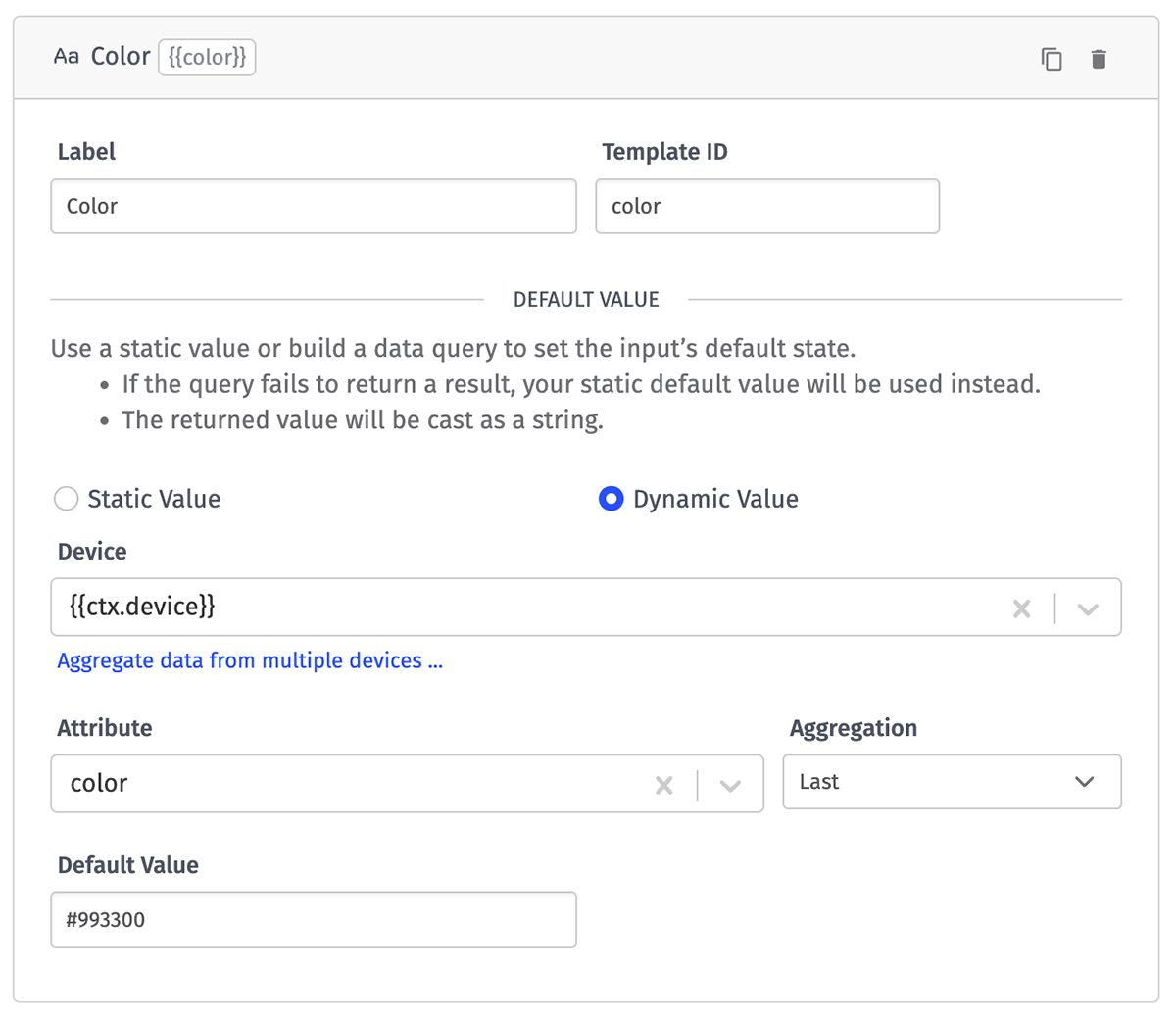
From the dashboard, enter some text within the text input field to use within the payload or command name.
Dropdown Selectors
Dropdowns allow for setting text values in the payload, but unlike a text input, the user's options are limited to an array of values specified in the block. When configuring the block, the default value is "no value", but custom options can be configured.
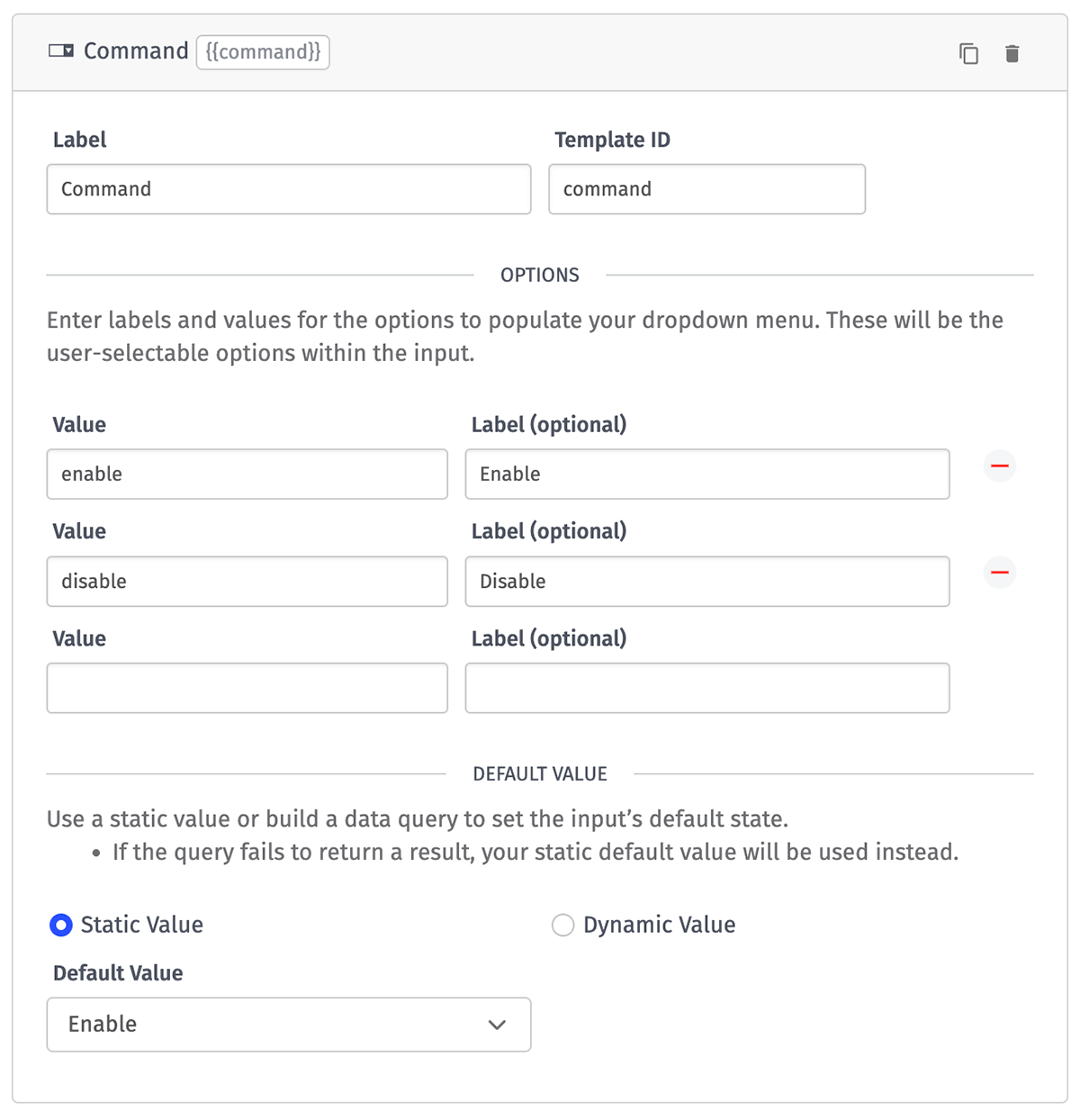
For each option, a "value" is required; this is the actual value that will be rendered out in the payload. Optionally, a label can be set for each value, which reflects how that value will be depicted in the dropdown. If no label is set, the option's value will serve as the label.
If the dropdown's value is set by a dynamic default, and the current value is not one of the configured options, the option will automatically be added to the dropdown and will be selected by default.
Button Triggers
Buttons are responsible for triggering device commands or workflows when clicked. Without a button, it is impossible to send commands or trigger workflows. Unless displaying device state within other controls, the Input Controls Block will need at least one button to send device commands or trigger workflows.
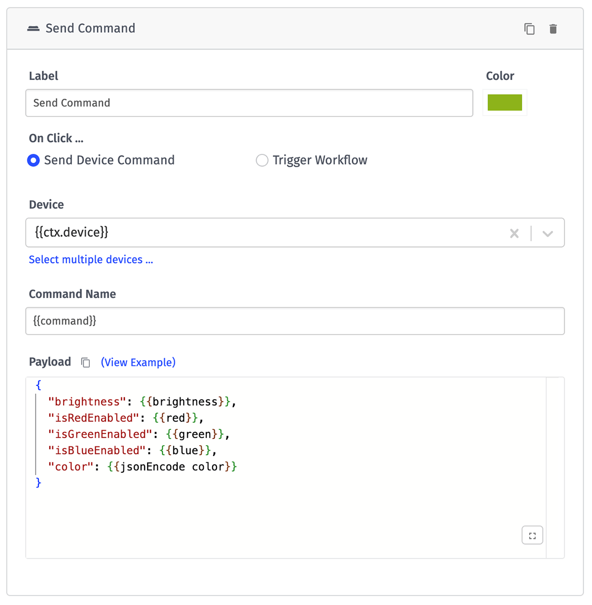
Send Device Command
To send a device command with a Button Trigger, select the Send Device Command radio button. This will display two required input fields:
- Device: A device query for which device(s) should receive the command. Note that the only available devices are the ones within the block's currently selected application.
- Command Name: The command that should be sent to the device(s). The field may be set with a static value (e.g.
setColor), or with a string template referencing values from the input controls or the default render context. - Payload: The payload to send along with the command to the selected devices. The payload can be constructed from input control values.
Trigger Workflow
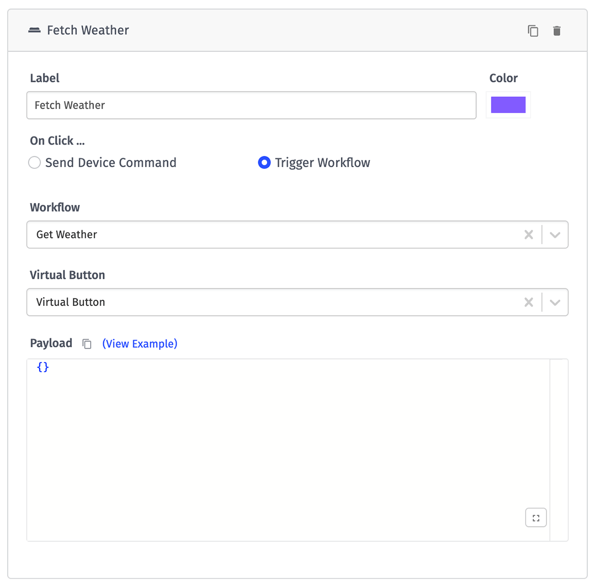
If the button should trigger a workflow, select the Trigger Workflow radio button. This will display the following input fields:
- Workflow: An application workflow that you would like to fire on press of the button.
- Virtual Button: A Virtual Button Trigger from the selected workflow, which will be triggered with the provided payload.
- Payload: The payload to fire the Virtual Button with, which will be available under the
dataproperty of the initial workflow execution. The payload can be constructed from input control values. If no payload is provided, the button will fire with its default payload. If you wish to send no payload, set the value to{}.
Help Blocks
The Help Block is a special component in the Input Controls Block that allows text to be displayed to users for the purpose of explaining, in greater detail than can be conveyed in a button label, what exactly will happen when a button is pressed and a workflow / device command is fired off.
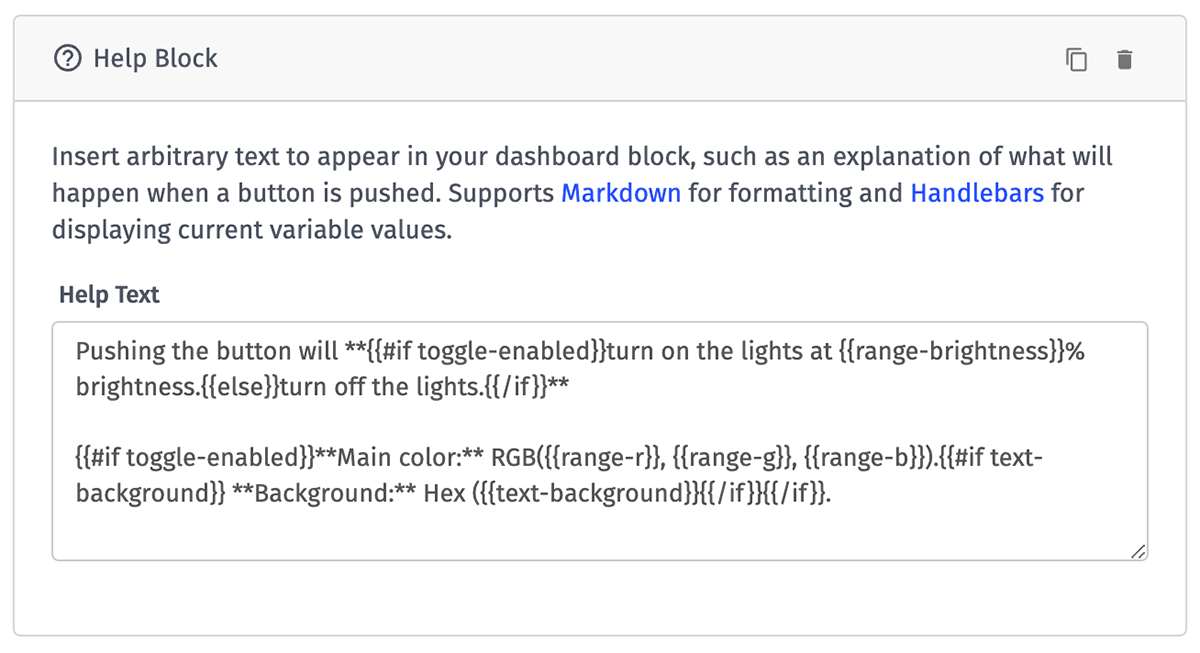
The component has only one input: a textarea in which arbitrary text and string templates referencing input values and default render context can be entered. These values will update as the user changes input values in the other components.
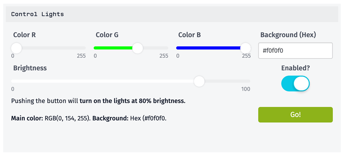
The textarea also supports Markdown, meaning that links, text formatting and even images can also be displayed within the Help Block.
The Help Block is the only Input Controls component whose height can be adjusted – up to four times a normal component's height.
Constructing Payloads
Device commands and workflow triggers may optionally be sent with a JSON payload, constructed as a JSON template. It is the purpose of the input controls to help construct the payload quickly and easily from the dashboard.
When constructing the JSON template, the values of the other inputs are referenced by their Template ID. For example, given the configuration from the Help Block example and constructing the payload with the following JSON template ...
{
  "brightness": {{range-brightness}},
  "enabled": {{toggle-enabled}},
  "foregroundColor": "rgb({{range-r}},{{range-g}},{range-b}})",
  "backgroundColor": "{{text-background}}",
  "sourceType": "dashboard",
  "sourceId": "{{dashboard.id}}"
}
... this will result in a command being sent to the selected devices with the following rendered payload ...
{
  "brightness": 80,
  "enabled": true,
  "foregroundColor": "rgb(0,154,255)",
  "backgroundColor": "#f0f0f0",
  "sourceType": "dashboard",
  "sourceId": "637b93981cfef333ba19923c"
}
The brightness value is passed as a number and enabled is passed as a boolean, whereas the R, G, and B values are passed as part of a string since the foregroundColor property's value is wrapped in double quotes. There is also a static property of sourceType being passed in with a value of "dashboard", and a sourceId property being provided as the dashboard ID (from the default render context).
Locked vs. Unlocked
In order to send commands or trigger workflows, the Input Controls block must be switched from "Locked" to "Unlocked".
In the block configuration, the option of setting the default mode of the block is available; this is the mode the block will be in when first displayed to the user.

When in "Locked Mode" ...
- Controls with dynamic default values will update as the dashboard data refreshes
- Buttons and controls are disabled, preventing user interaction. This is to ensure that a stray mouse press does not trigger an unintentional action.
When in "Unlocked Mode" ...
- Controls with dynamic defaults cease to update with dashboard data refreshes. (Dynamic default indicators in the control labels will disappear to indicate this.) This holds true until the block is put back into "Locked Mode".
- Buttons can be pressed and controls can be adjusted, thereby allowing commands to be sent to devices and workflows to be triggered.
- If the default mode of the block is "Unlocked", dynamic defaults will load once, on the initial dashboard load.
Was this page helpful?
Still looking for help? You can also search the Losant Forums or submit your question there.