Time Series Graph
The Time Series Graph allows you to display and compare historical telemetry data across multiple devices and attributes.
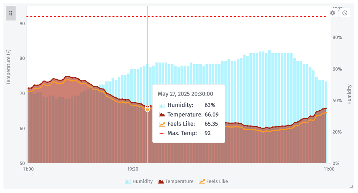
Users may hover their mouse over the graph to display a tooltip, which shows the value of each series at that moment in time. If any other Time Series Graphs within the same dashboard have data at the same timestamp, those graphs will also display their tooltip at the corresponding timestamp automatically.
Configuration
There are a number of configuration options for the graph as a whole, as well as its individual series.
Data Type
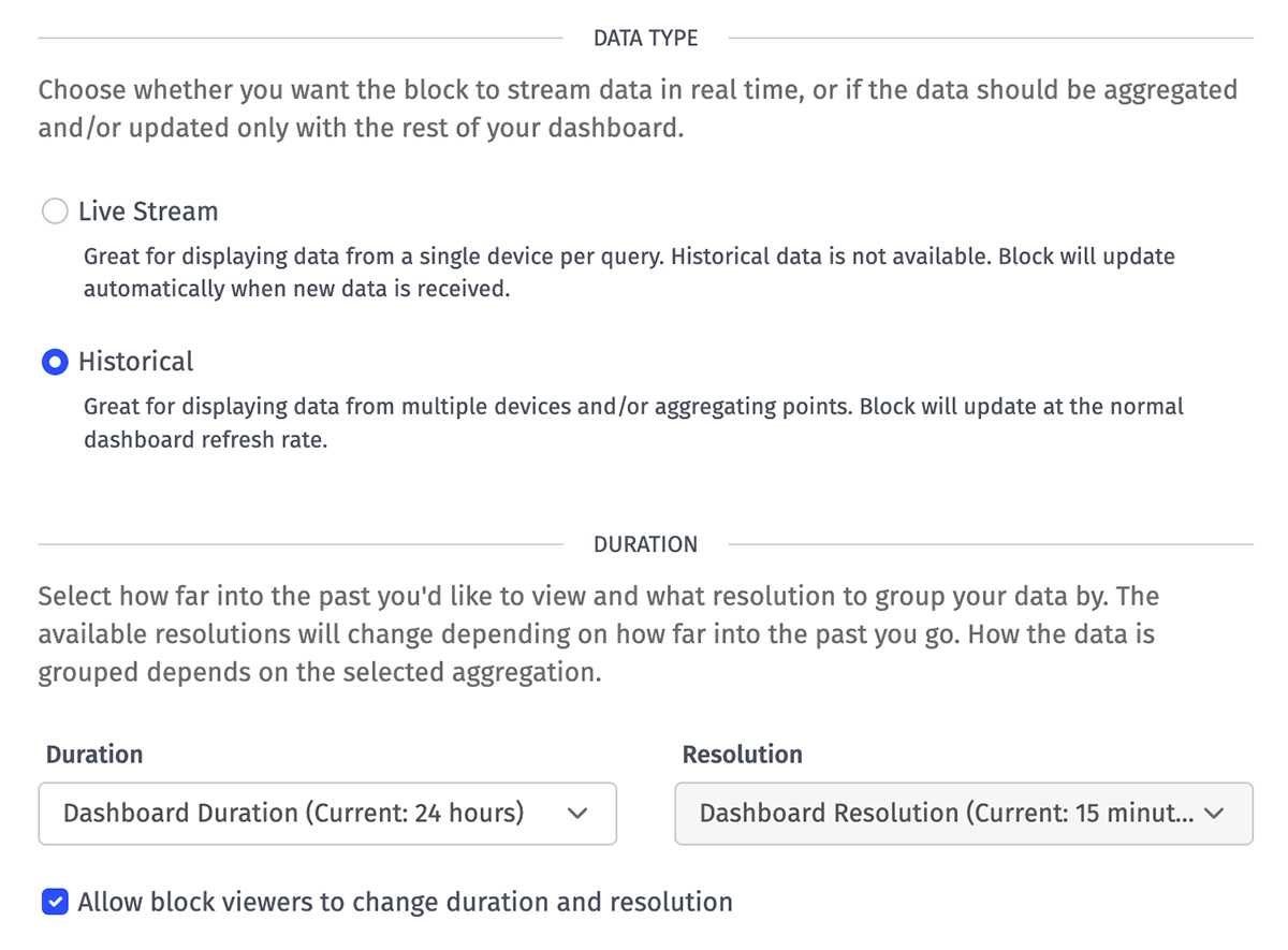
The Time Series Graph can display points as a live stream (rendering a point on the graph as soon as the data hits the platform) or as a historical graph. Each style has its own advantages:
- Live stream graphs provide feedback with more immediacy than historical graphs, as they do not require a dashboard data refresh to populate with new data. If a graph segment references multiple devices by ID or tag, a point will be rendered on the graph for that segment anytime any of the matching devices reports state for the chosen attribute.
- Historical graphs allow for data to be aggregated according to a number of rules (based on time ranges, mathematical functions and the combination of data from multiple sources), and they also allow for viewing past dashboard states.
Duration and Resolution
Next, set a Duration - or, the length of time depicted across the graph's X axis. This defaults to your dashboard's global duration, though you may select any duration ranging from 5 minutes up to 180 days.
Once you have chosen a duration, also select an appropriate Resolution for the graph, which represents the length of time for each time bucket (or point) on the graph. Lower resolutions lead to more points represented on the graph - which, depending on the data being depicted, may or may not be desirable. When choosing the dashboard's global duration, the resolution automatically sets to the global resolution and cannot be changed without first changing the duration.
The resolution and the aggregation specified in the block data section work together to generate a data point. For example, if the resolution is 60 minutes and the aggregator is Mean, Losant will average all of the data together in 60-minute increments to create a single point on the graph per hour on the hour.
If the Allow block viewers to change duration and resolution option is selected, consumers of the dashboard will have the option of choosing different durations and resolutions in the dashboard view, either by selecting them from the dropdown menu or by zooming in on sections of the graph.
Note: If "Live Stream" is selected as the data type, the "Resolution" selector and the "Allow block viewers to change duration and resolution" checkbox disappear from the block configuration. For "Historical" graphs, the "Resolution" setting is ignored for any graph segment that uses a "None" aggregation method; instead, all of the segment's data points are represented as their true, unaggregated values down to the millisecond timestamp.
Block Data
The Time Series Graph is configured as individual series. The example above is displaying weather data for a particular city over the past 24 hours. Since "Temperature", "Feels Like", and "Humidity" are each configured as separate series, each value displays as its own graph on the chart.
To add a new segment to the graph, click the "Add Segment" button at the bottom of the configuration panel. At least one series is required. The order of segments can also be rearranged by dragging and dropping each segment by its panel header; segments defined first appear behind segments defined later.
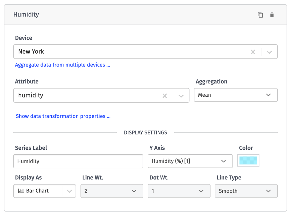
There are a number of configuration options for each series:
- Device: A device query for selecting the device(s) that should be part of the query. When selecting multiple devices by IDs or by tag(s), the values recorded across all matching devices for the chosen attribute will be aggregated into a single point per resolution bucket using the segment's chosen aggregation method. When selecting an aggregation method of "None", only a single device may be selected for the segment.
- Attribute: The single device attribute to graph in the series. Depending on the chosen aggregation method, some attribute data types cannot be depicted on a time series graph.
- Aggregation: The aggregator applied to the series based on the chosen devices and resolution. The above example has the resolution set to 15 minutes. This means if weather data is being reported once every five minutes, each data point on the graph will be the average of three readings since "MEAN" is the chosen aggregation method.
- Note: If "live stream" is chosen for the graph's data type, this setting is not applicable.
Data Transformation Properties
Optionally, you may apply additional transformations to the data returned for the chosen device(s), attribute, and aggregation method. To expose these advanced options, click the "Show data transformation properties" link ...
- Expression: Allows you to apply an expression to each data point in the segment. If an invalid expression is provided, the point reverts to its raw value. In addition to the default render context, you have access to the following variables when evaluating the expression:
{{value}}- The raw data point's value.{{time}}- Time of the data point in milliseconds since Epoch.{{ctx.VARIABLE_NAME}}- Value of a given context variable.
- Cumulative, when checked, means that the point graphed at any given time is the sum of that point plus all previous points that are currently displayed.
- Connect Line Across Data Gaps: When checked, the series display a line between all reported data points. If not checked, the line connecting data points will break if no data was reported for that resolution bucket. If "Bar" is selected for the display style, this option is disabled.
Display Settings
There are also a handful of parameters that only affect the graph's display properties and not the data itself:
- Series Label is the label to apply to the data series in the graph's legend and tooltip.
- Y Axis defines which of your block's Y axes to graph this segment's data against.
- Color is the color used to represent the data in the chart. These are automatically assigned as series are added, but each can be overridden.
- Display As is the graph type. "Line" is the default, but series may also be displayed as bar charts or area charts.
- Dot Weight is the thickness of the dot applied to the series. If "Bar" is selected for the display style, this option is disabled.
- Line Weight is the thickness of the line applied to the series. If "Bar" is selected for the display style, this option is disabled.
- Line Type is the style of the line applied to the series. If "Bar" is selected for the display style, this option is disabled.
Y Axes
Next, define at least one Y axis to use within this chart. Data segments and decorators are then assigned to each axis you create. Axes may be rearranged by dragging and dropping their panel headers.

- Label is an optional label to apply to the Y Axis.
- Position is where to display the axis in the block. Options are "Left", "Right", or "Hidden". A hidden axis will apply all other axis settings to the segments and decorators assigned to the axis without actually displaying the axis on the chart.
- Axis Scale determines how to space the ticks between the axis's minimum and maximum values. Options are "Linear", "Logarithmic" (base 10), or "Square Root".
- Min and Max are user-defined caps at the bottom and top of the axis, respectively. Data for the series will be graphed on this scale. If you choose not to define a minimum or maximum value, the Time Series Graph will automatically define a scale based on the data series and decorators assigned to the axis.
- Y Axis Format is a D3 format string for formatting the ticks along the axis, as well as the values that display in the graph's tooltip on hover.
- Stack area and bar segments, if checked, will draw any area and bar segments assigned to this axis as a stacked chart. Any line segments assigned to the axis will not be stacked and will appear as normal alongside the stacked segments.
Decorators
Optionally, define one or more reference lines or areas that will appear as static markers on the graph. Decorators take the following properties ...

- Type can be either "Line" or "Area".
- If "Line" is selected, you must define a Y Position, which is the value on the Y Axis against which the horizontal reference line will be drawn.
- If "Area" is selected, at least one of Y Floor and Y Ceiling must be defined, each of which serves as the bounds of the drawn area. If only one is defined, the area will extend infinitely up or down from the value that is defined.
- Y Axis defines which Y axis to chart the area against.
- Note: If the selected Y axis does not have a Min or Max defined, the axis's domain will automatically extend to ensure the decorator is visible.
- Label is an optional label to apply to the decorator in the graph's tooltip.
- Line Weight is the thickness of the decorator's boundary line(s).
- Line Style is the type of line to draw as the boundary. Options are "Solid", "Dotted", or "Dashed".
- Color is the color of the decorator line / area.
Legend
Optionally, you may choose to display a legend at the bottom of the graph, which depicts each segment's label, chart type, and color beneath the chart. In addition to providing a key for what each segment represents, legend items may be clicked to temporarily hide segments.
Changing Graph Time Ranges
If you have enabled the Allow block viewers to change duration and resolution option, it is possible for end users to change the graph's end time, duration, and resolution from the dashboard view. This allows for a quick glimpse of the data from your Time Series Graph at different time range settings without having to edit the block configuration. This can be accomplished one of two ways ...
Mouse-Based Zooming
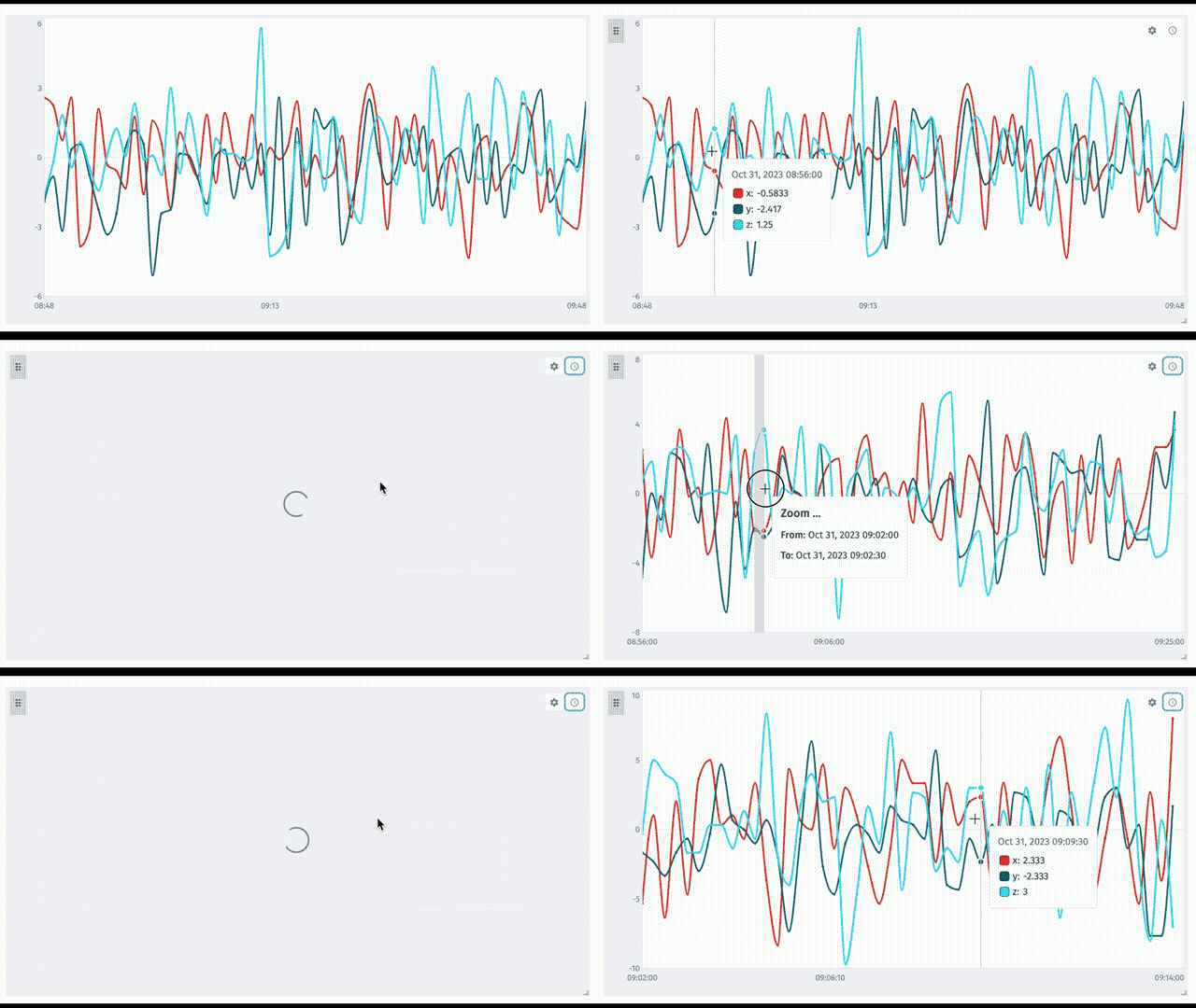
Hovering your mouse over the graph will display a tooltip representing the point in time where the cursor appears, along with any segment values associated with that timestamp. By clicking and holding the mouse and dragging in either direction, you may select a time range to set as the graph's temporary start and end point. When doing so, the dashboard's resolution will automatically set to a value approximately matching the original graph's granularity.
Block Dropdown
Alternatively, you may change the graph's duration and/or resolution by clicking the time selector in the top right corner of the block. This will display a dropdown with other time range options. (Your resolution may automatically change to a new value if its current value is not valid given a new duration.)
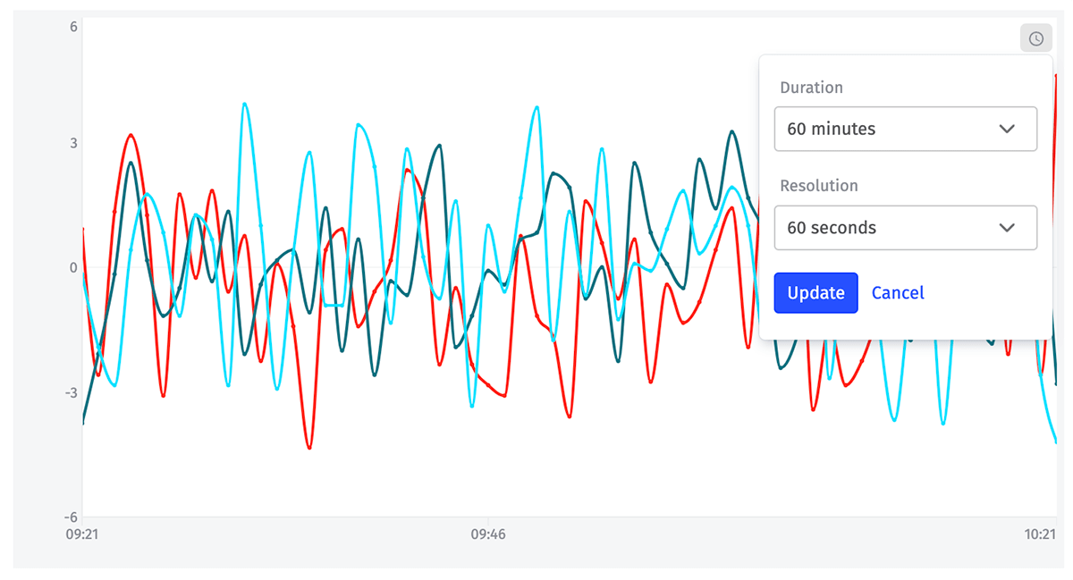
After selecting a new time range, click Update to change your graph to the new time selection.
Resetting Custom Ranges
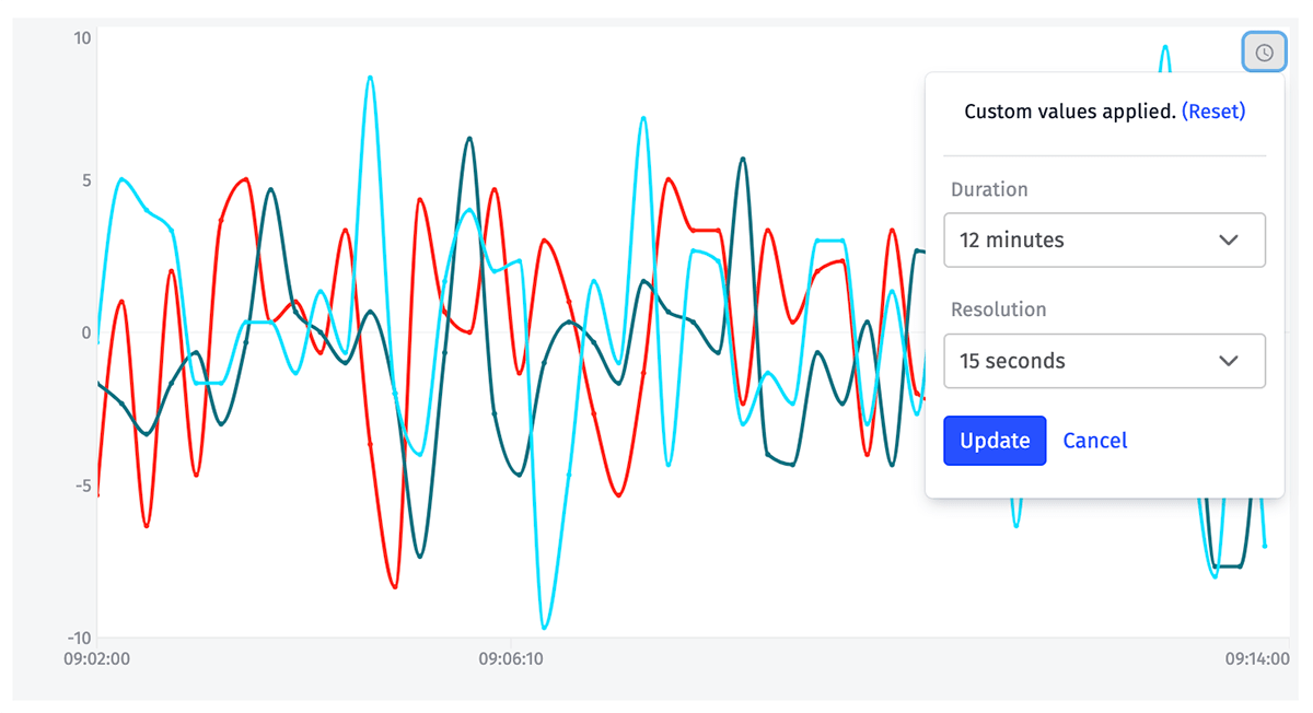
If a custom time range is applied through either method, the graph will indicate that state by highlighting and displaying the time range dropdown. Opening the menu displays the currently selected duration and resolution, as well as a link to reset the dashboard block to its original state.
Was this page helpful?
Still looking for help? You can also search the Losant Forums or submit your question there.